
UGL (Unione Generale del Lavoro) is one of Italy’s most representative trade unions, dedicated to protecting the rights of workers and retirees. With over 70 years of history, it places the individual and human relationships at its core. Today, UGL addresses the challenges of a changing world through a vision that blends experience, innovation, and community.
Brand Identity. UGL’s Mission
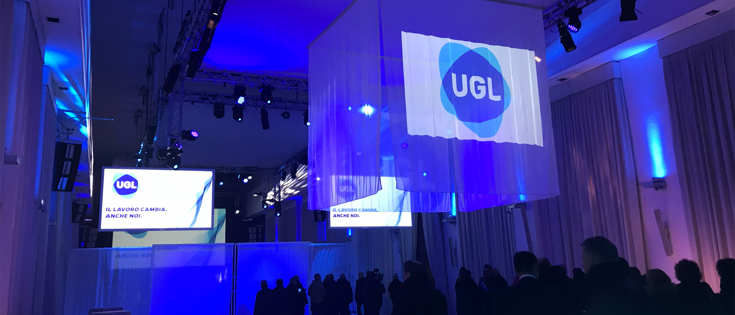
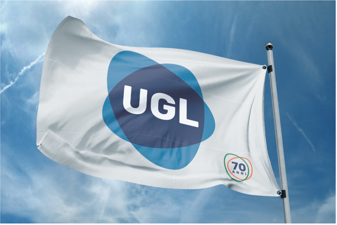
To mark its 70th anniversary, UGL embarked on a comprehensive rebranding journey to reinterpret its history and redefine its relationship with its members. The goal was a paradigm shift in worker protection: a more human and inclusive approach capable of responding to contemporary uncertainty. In line with the changes of our time, the new brand reflects fluid and dynamic relationships, extending the union’s influence across all social categories while conveying energy, confidence, and openness toward new horizons.
Brand Design. A Sign of Flexibility
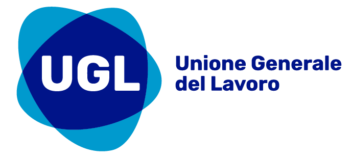
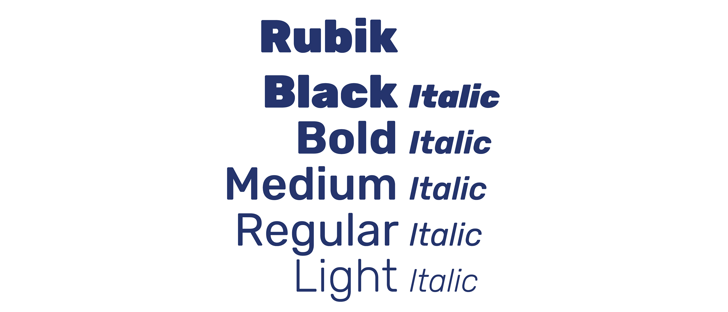
The UGL logo synthesizes the concepts of fluidity and openness, visually translating the union’s ability to adapt and engage with the complexity of the contemporary world. Its liquid form symbolizes adaptability, while the color palette of light and dark blue conveys security and reliability. The logotype’s typeface, Rubik, a humanist sans-serif with slightly rounded corners, provides a friendly and legible appearance, ensuring visual consistency across all applications while conveying authority and modernity.
Video & Motion Design. The Heart and Identity of the Union
The celebratory video and logo animations highlight the vital energy of the new brand, portraying a union that pulses like a heart. Fluid sequences and colored lines that reassemble into the symbol create a dynamic visual language, capable of conveying the values of connection and community. This approach strengthens multi-channel communication and reinforces the perception of UGL as a modern organization that is close to the people.