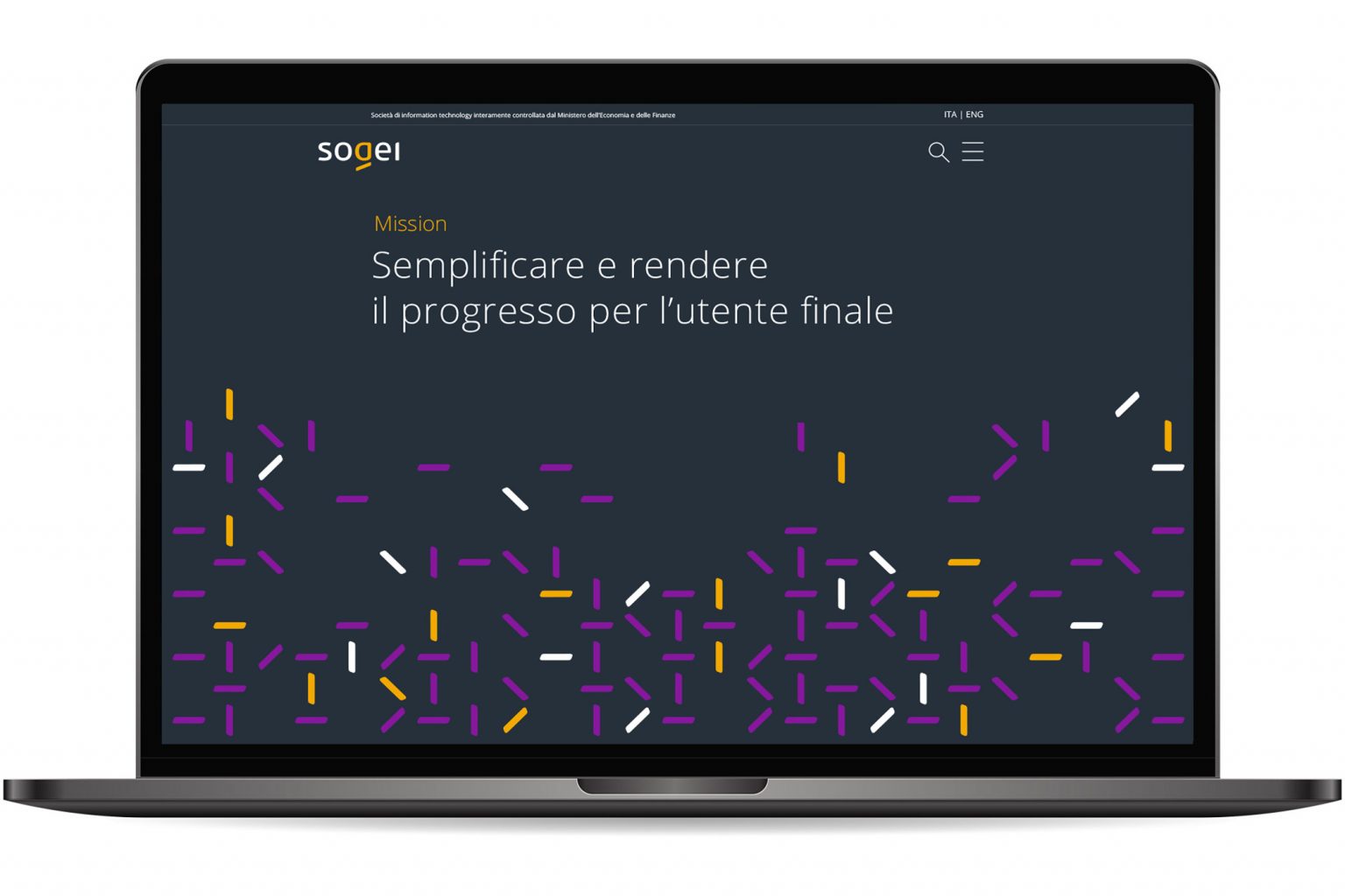
Sogei is the Information Technology company of the Ministry of Economy and Finance (MEF), which has launched an ambitious project: to offer citizens simple, fast, and fully digital services.
Brand Design. Digital services focused on the citizen
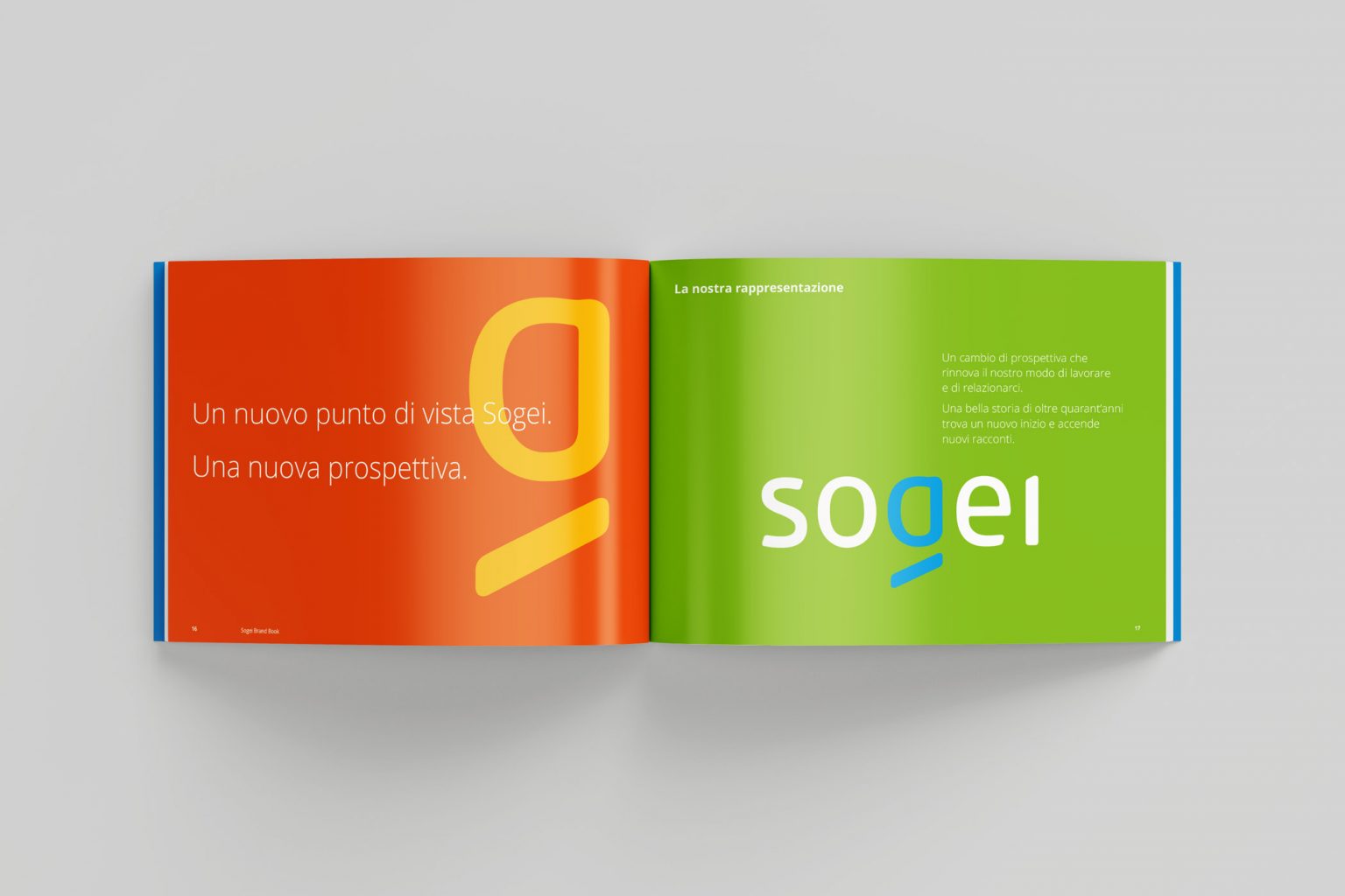
The rebranding aimed to reflect the company’s shift in perspective, focused on digitalization and simplification, by placing the emphasis on the citizen experience. The new corporate identity is a signature expressed through a clean graphic form: the logotype, created with a custom-designed typeface, where the use of lowercase letters and curved shapes emphasizes a relational dimension.
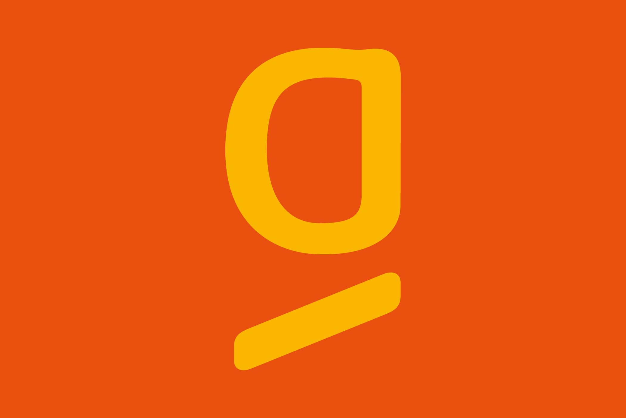
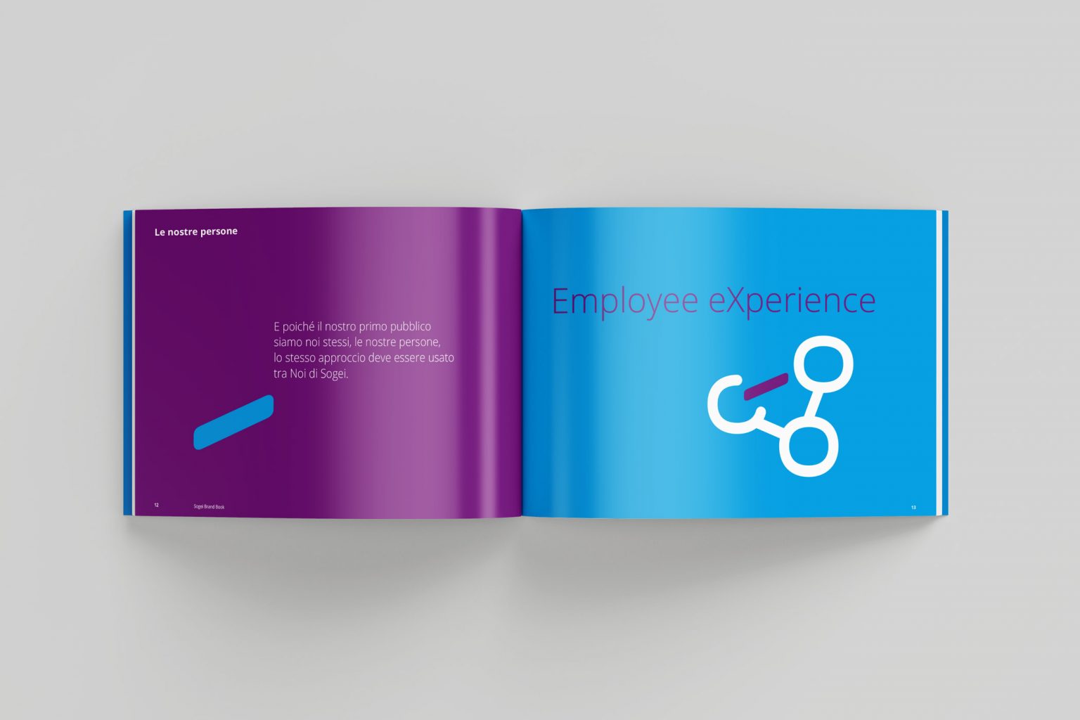
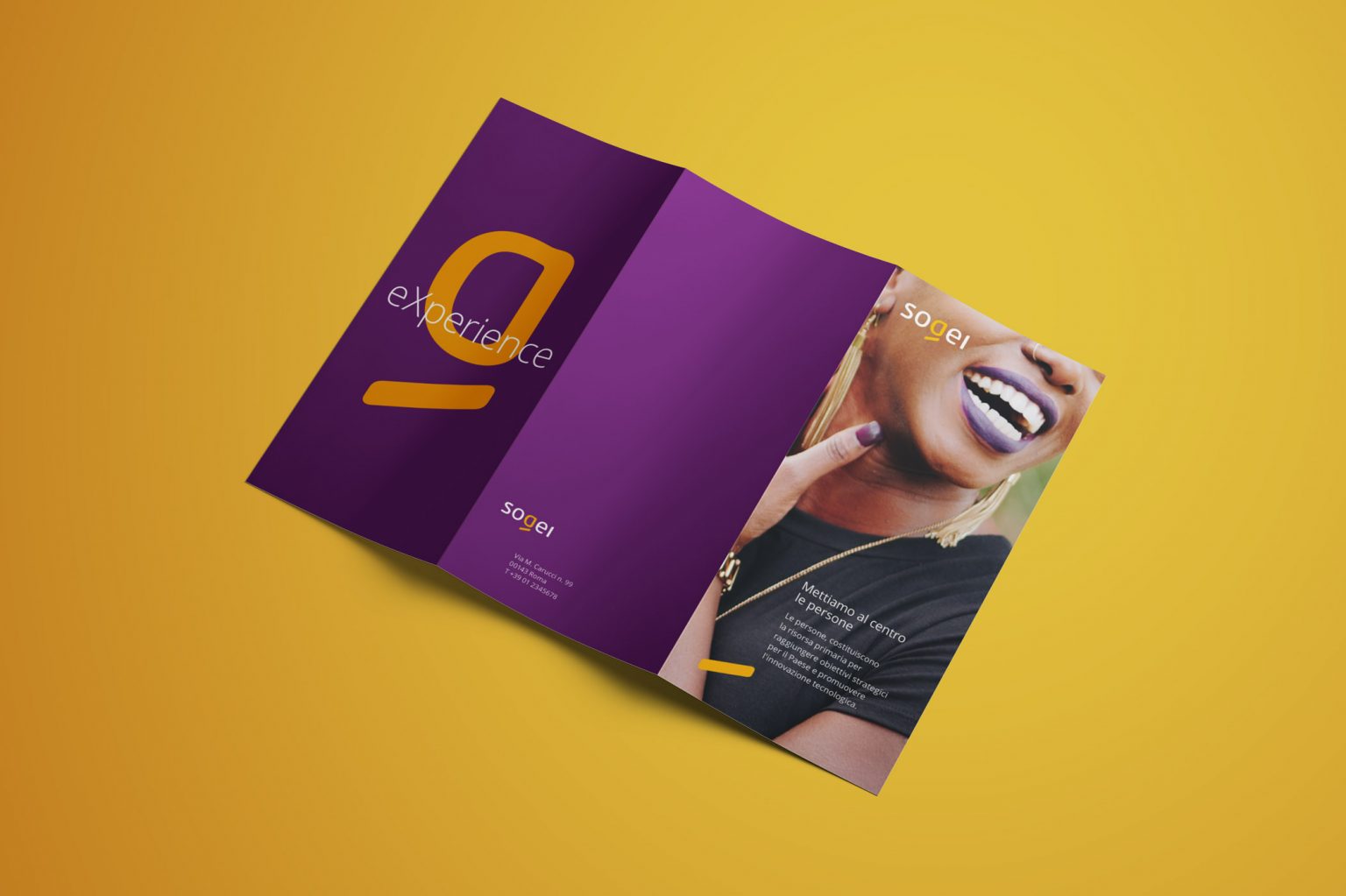
The letter “g”, at the center of the name Sogei, symbolizes the centrality of the individual—who lies at the heart of the company’s mission—in its dialogue with citizens, institutions, its own people, and, more broadly, all stakeholders.