Snam
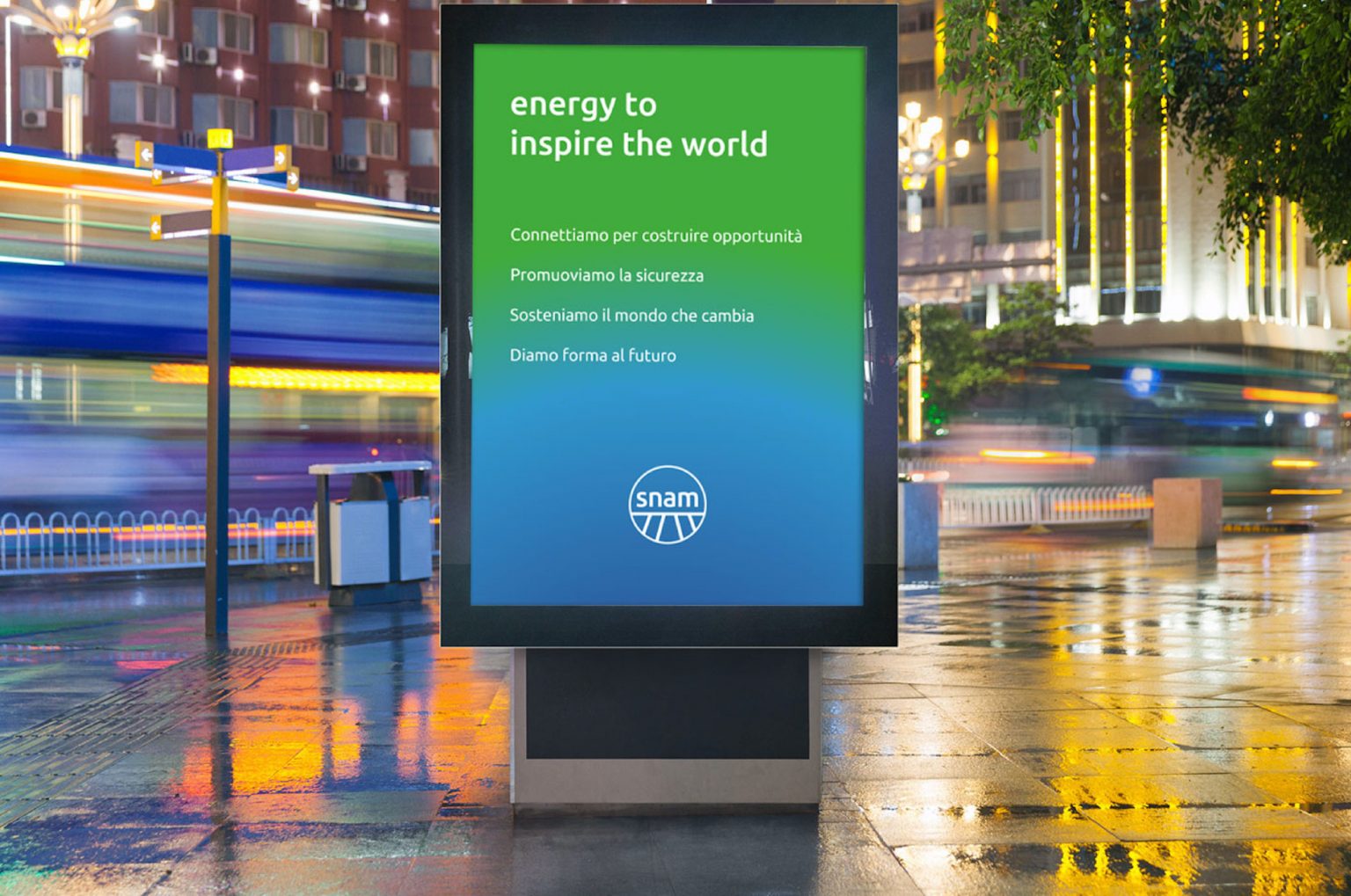
Energy to inspire the world
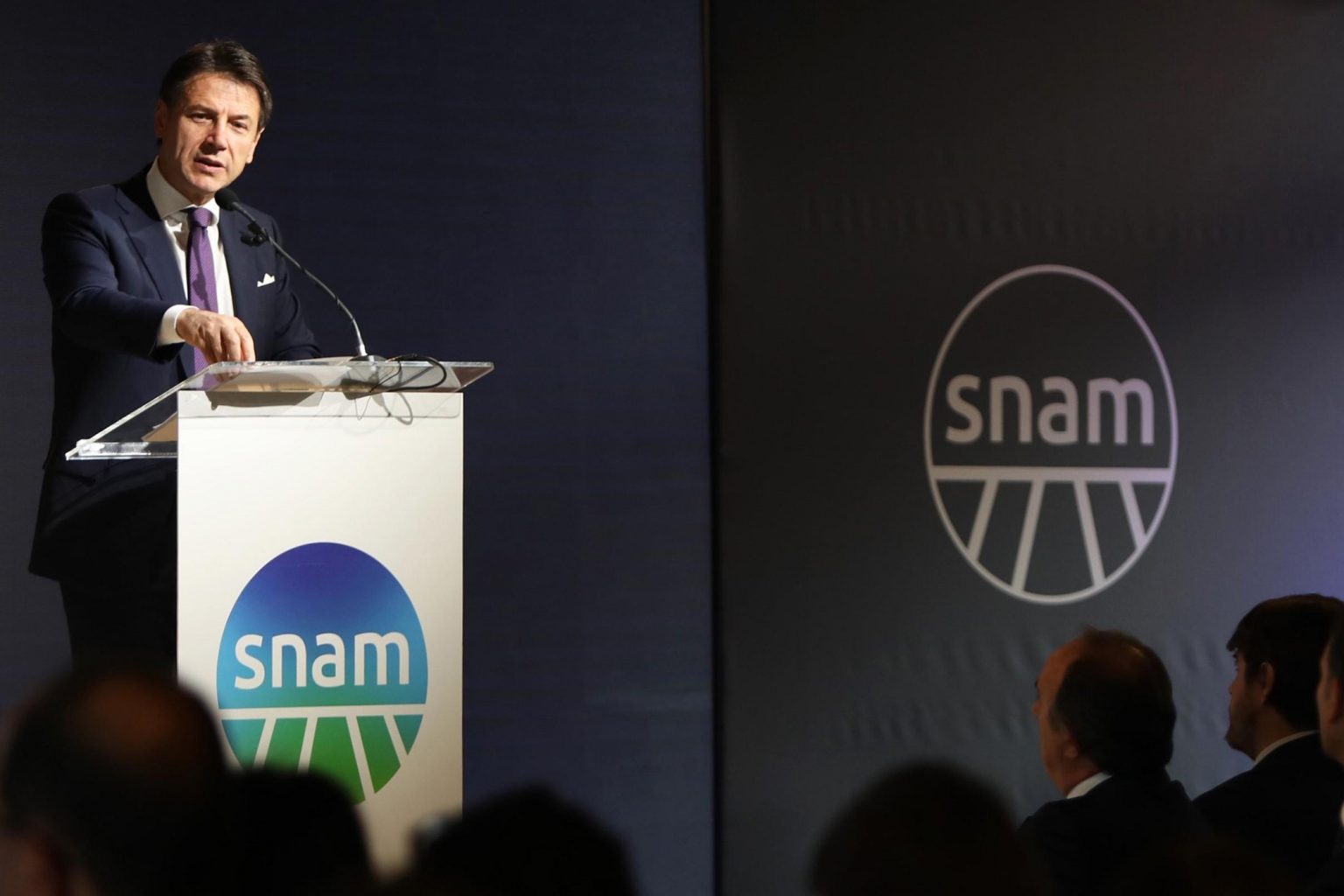
Snam is one of the leading energy infrastructure companies in the world and one of the largest publicly traded Italian companies by market capitalization.
Brand Design. An identity in continuity
In line with an increasingly sustainable network, Snam has redefined its brand, emphasizing the relational dimension. The new identity is fully in continuity with its tradition: the transition from the previous logo (also designed by Inarea) to the new one is smooth, consistent, uninterrupted, yet full of novelty and a renewed relationship.
The rebranding journey undertaken for Snam introduces the logo into a new realm of meaning: from the base of the logo, rays emanate, symbolizing a technology that brings well-being and balance. A technology and energy to inspire the world, to radiate it, and to reach it with the essence of its work. A project that is told through graphic synthesis.


Brand Architecture. A landscape of values and business realities
The design process that guided the creation of this ‘renewed’ logo marks the transition from an idea of a network – including its values – to a concept where the landscape emerges, serving as an immediate evocation of environmental responsibility.
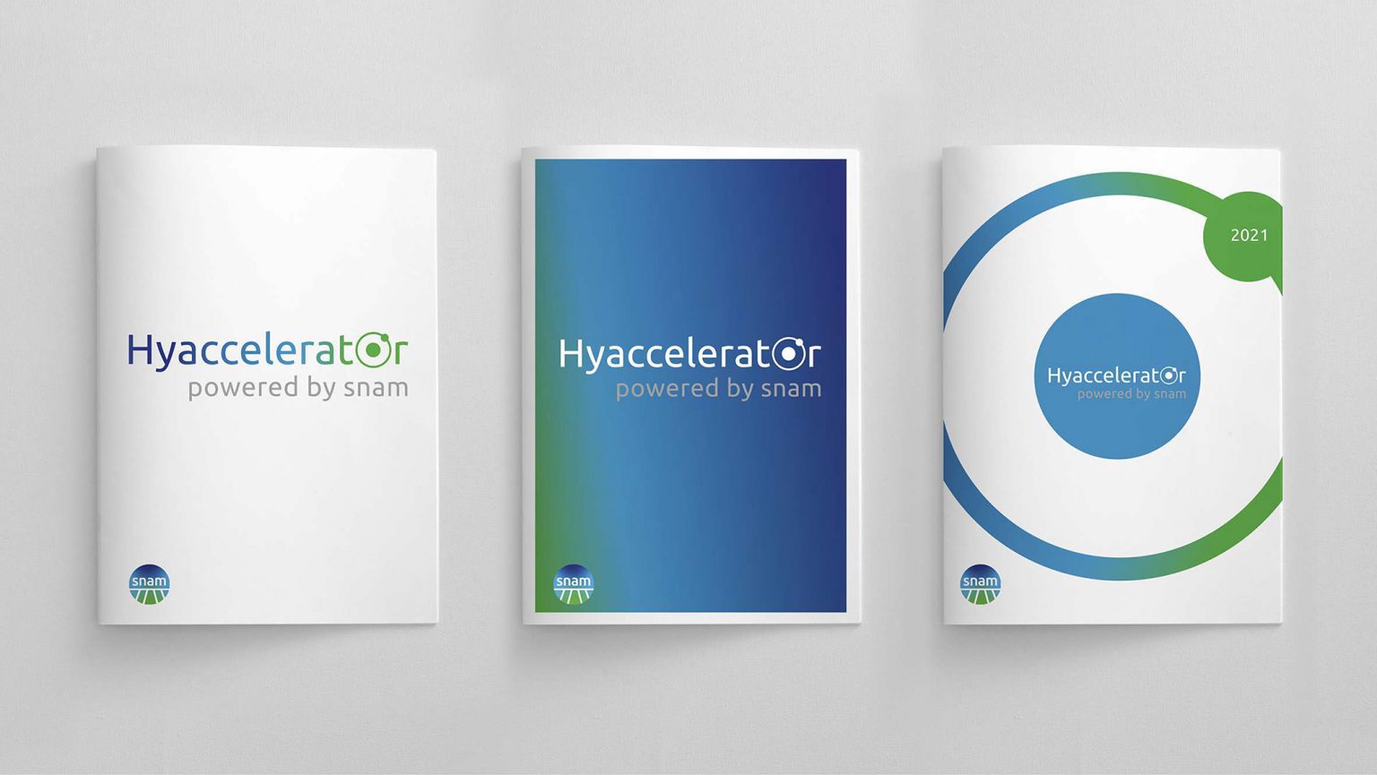
Concepts that are also reflected in the identity of the company’s other brands, such as Hyaccelerator and Jarvis.
The start-up Hyaccelerator
Hyaccelerator is the first global accelerator for hydrogen start-ups launched by a company, Snam. The goal is to enhance the most innovative players in the sector, bringing high-potential projects to life.

The Jarvis platform
Jarvis is a commercial platform used by Snam’s clients, the shippers, through which they can access gas trading data.
Jarvis represents one of the key highlights of Snam’s digitalization. Developed in co-design with its clients, Jarvis focuses on a revolutionary UX and a new Customer-Centric service model.
Communication and Editorial Design. The integration of touchpoints
Forms and corporate communication, video and motion design are other projects that Inarea has worked on for Snam to create a unified system in which the corporate identity can be recognized.