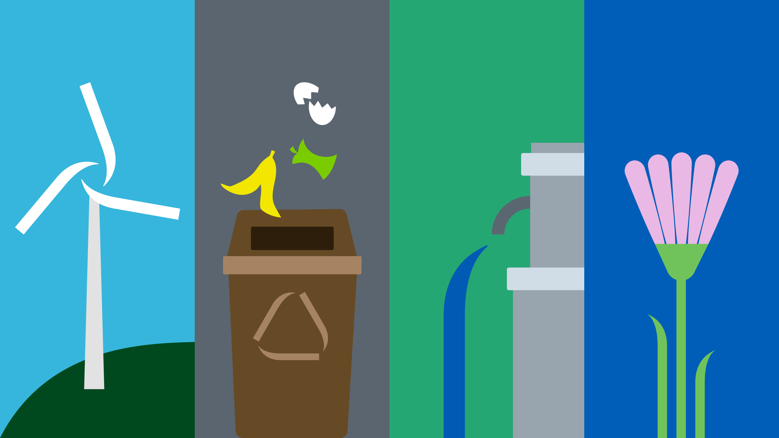
Plures is the new name of the multiutility born in Tuscany from the merger of Alia Servizi Ambientali, Publiservizi, Consiag and Acqua Toscana. A public company operating in the sectors of environment, energy and water cycle, serving over one and a half million citizens. The name marks a step forward towards a common, shared and innovative vision. Plures – from the Latin “plures”, meaning “the many”, and by extension “plurality” – expresses the richness of diversity, the strength of collaboration and an industrial vision able to go beyond localism and speak the language of a shared future.

Brand design: a logotype to represent plurality
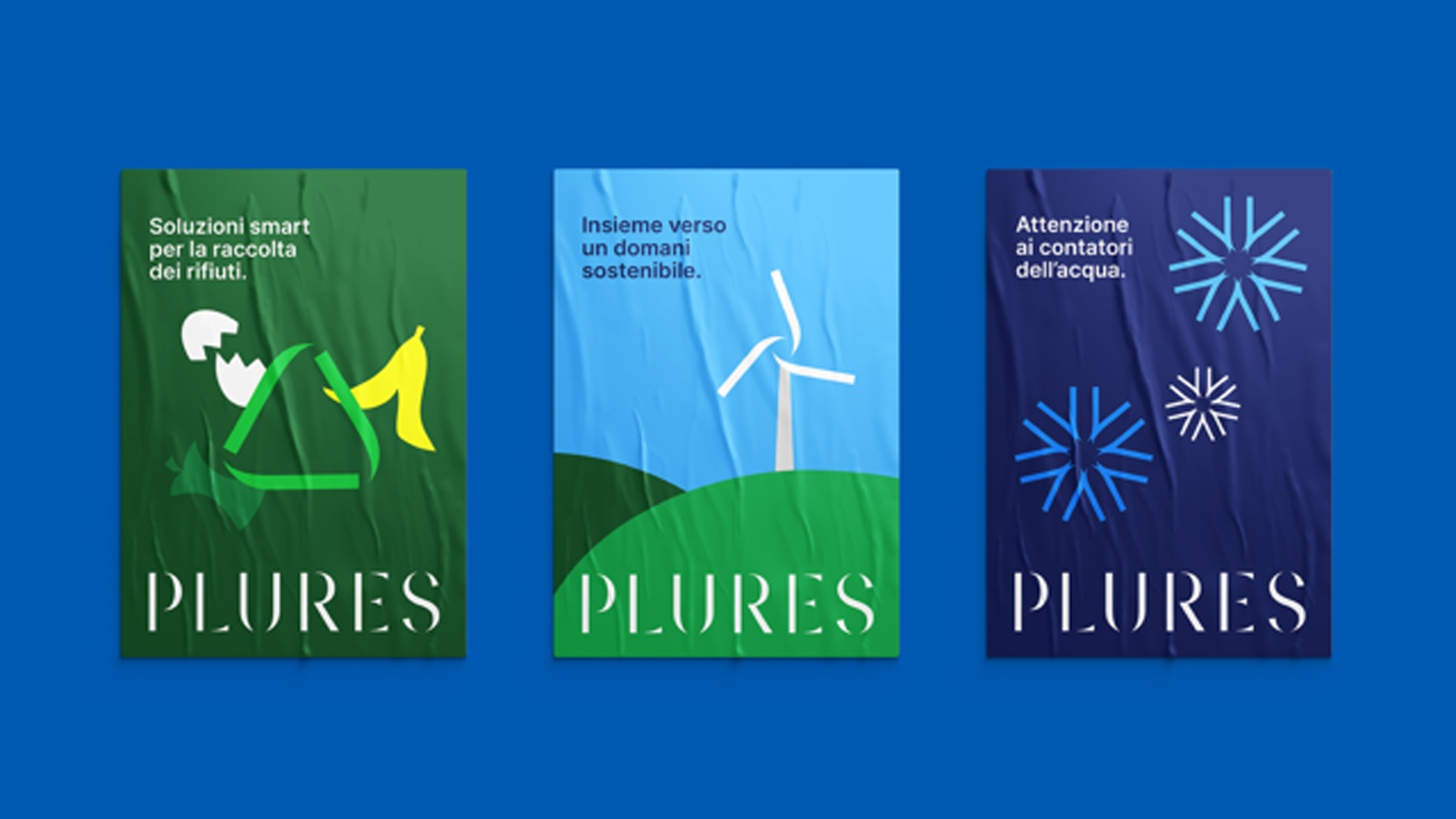
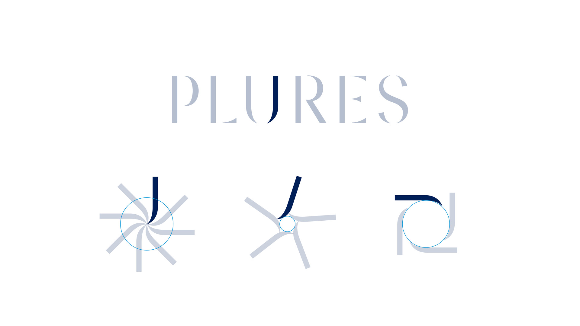
To express the new identity, Inarea created a logotype that is both essential and distinctive. The capital letters, in a custom-designed stencil typeface, evoke elegance, lightness and modularity, creating a contemporary and easily recognizable visual identity. The logo design also responds to the need, defined by the
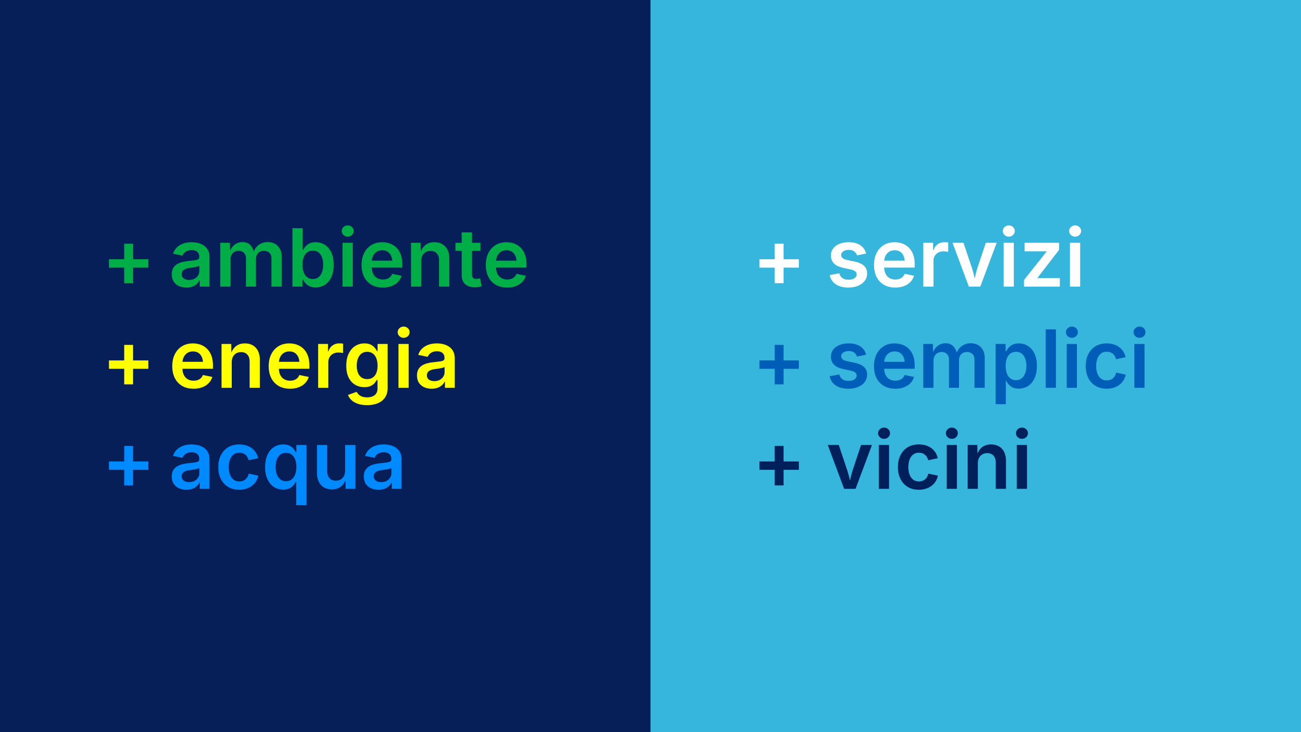
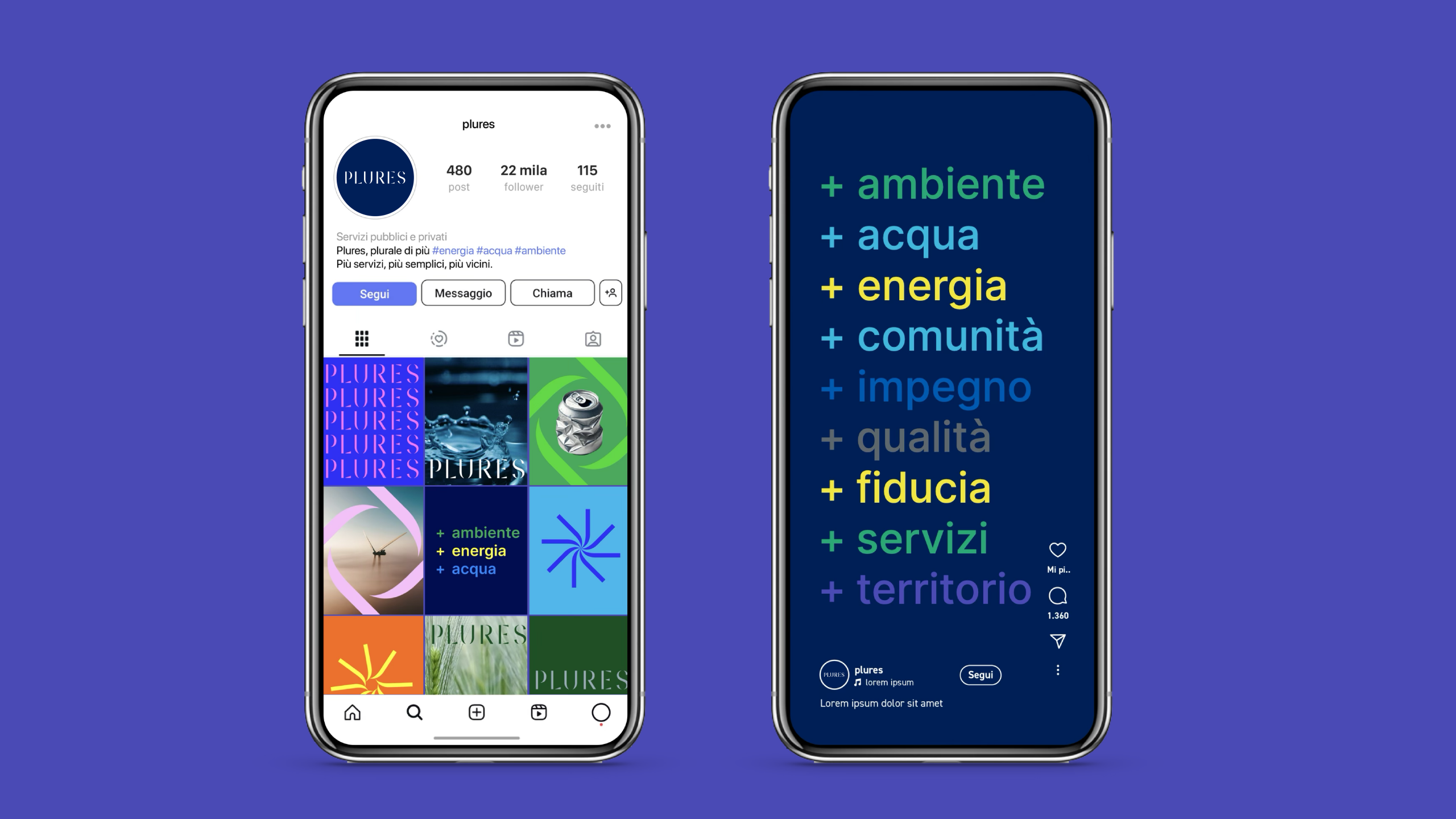
Plures is therefore a sum of experiences, energies and skills. A tool of connection: between people, territories, and the past and future of local public service.