Puglia
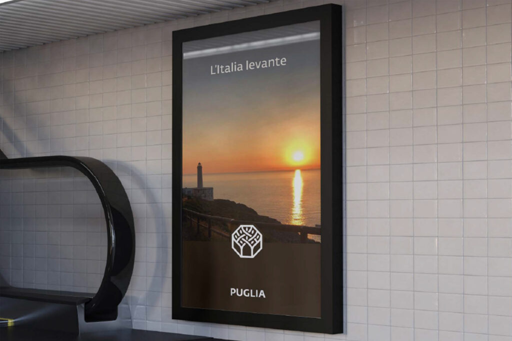
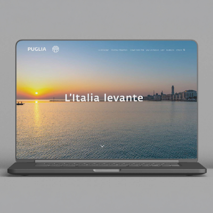
L'Italia levante
Few regions in Italy have achieved the kind of recognition and momentum that Puglia has in recent years. Simply mentioning the name of the region immediately evokes positive associations and shared values. Puglia has therefore already established itself as a destination brand—one that the regional institution has chosen to strengthen by defining, through its brand identity, a clear and consistent way of representing the region.
Brand architecture and positioning
The entities directly connected to the Region—departments, agencies and publicly owned companies—presented themselves through a fragmented and heterogeneous visual landscape. A monolithic brand architecture was therefore introduced, bringing every entity back to a single identity reference capable of supporting the entire Made in Puglia system with far greater strength and coherence.
Adopting a single brand thus became the explicit expression of a new positioning for the Region: shifting from a perception primarily tied to tourism to that of a place of opportunity, reflecting both the diversity of its offering and the distinctive quality of life it provides.
Brand design
Logotype
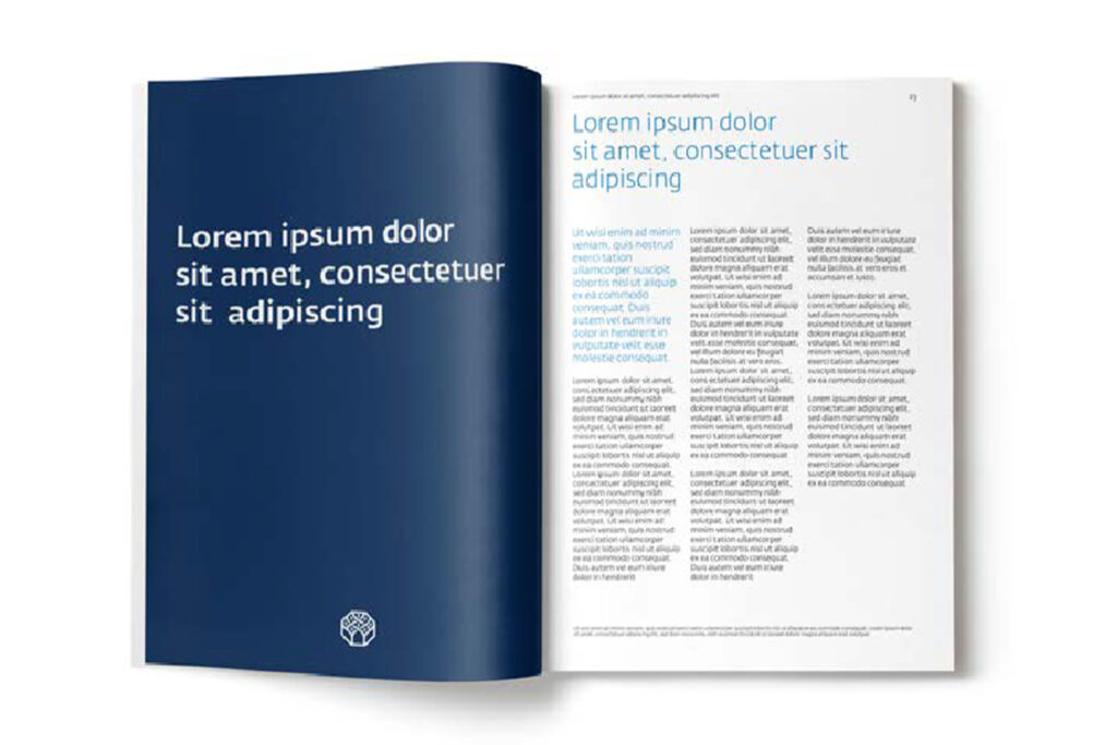
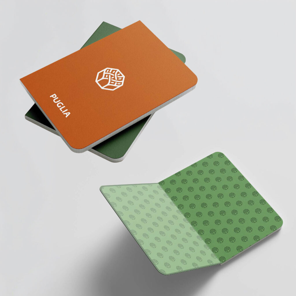
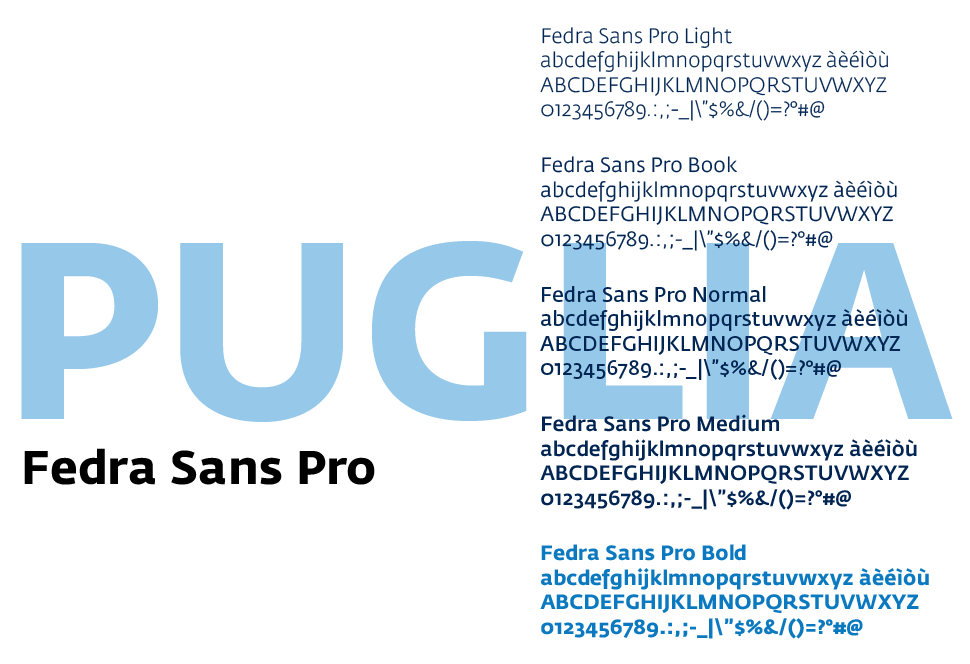
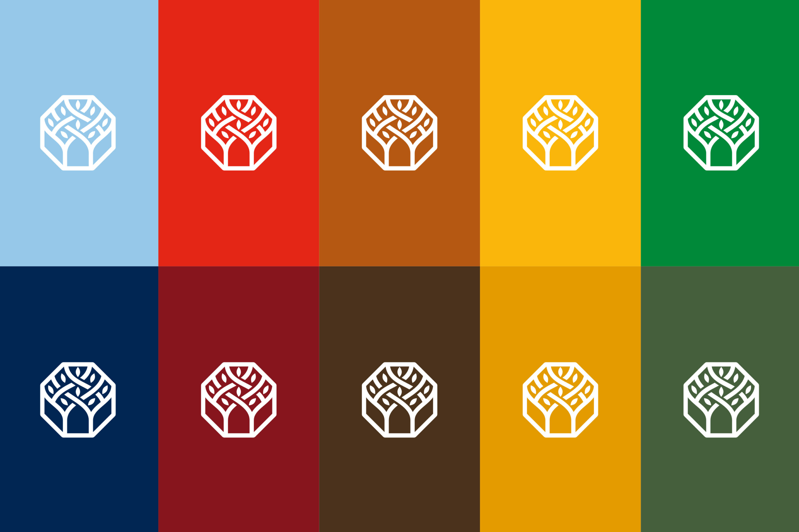
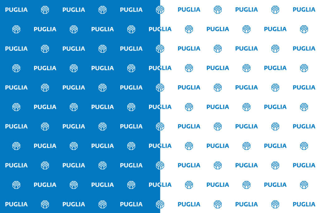
The word “Puglia” becomes the constant reference point. From a design perspective, the existing logotype has been retained—set in uppercase using the Fedra Sans Pro typeface—and paired with the symbol in blue, which becomes the primary color of the identity system.
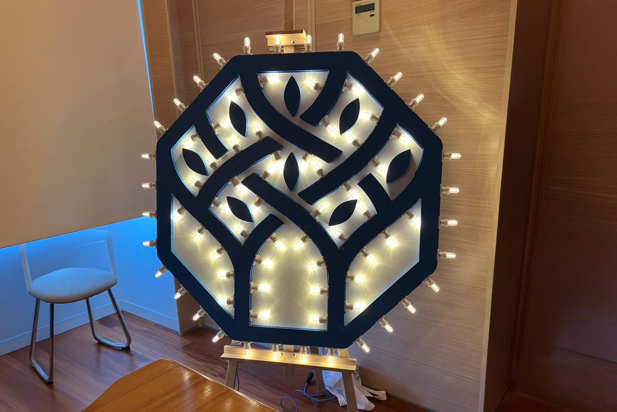
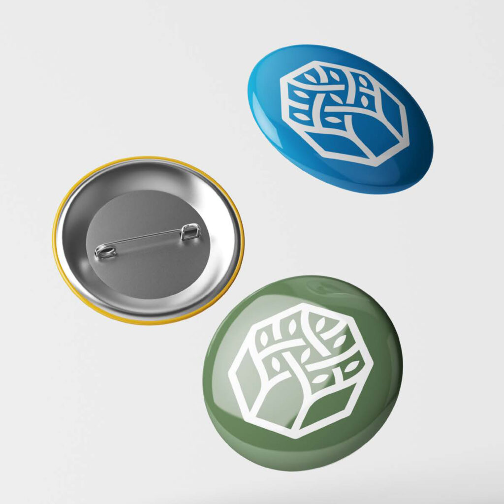
Symbol
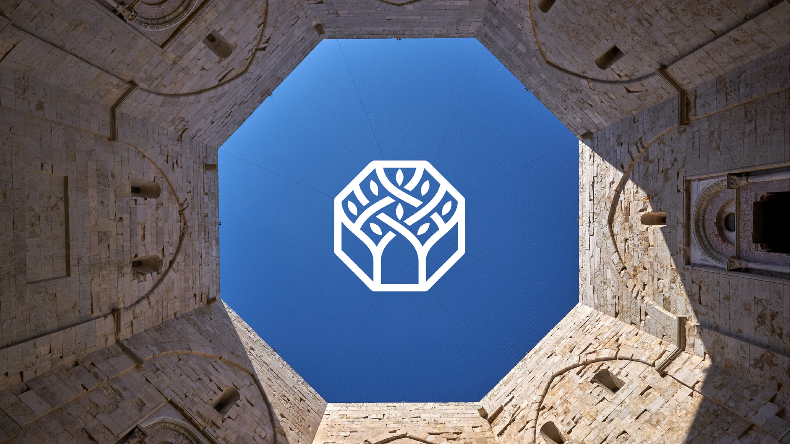
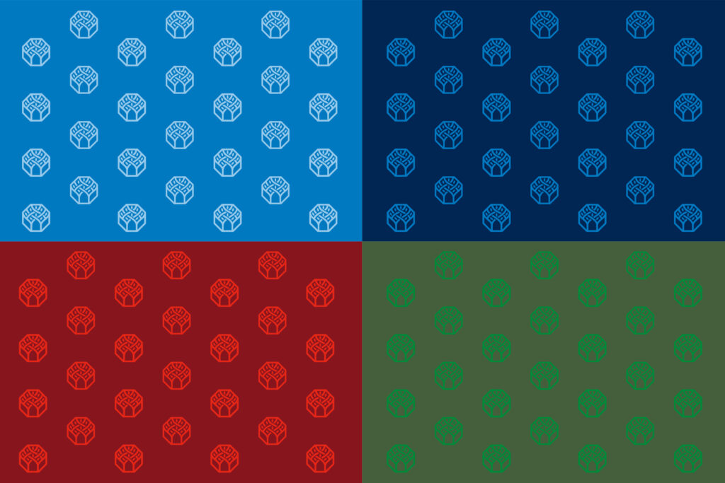
The symbol draws inspiration from the heraldic elements of the regional coat of arms. A regular octagon—whose subtle three-dimensional effect echoes the architectural structure of Castel del Monte—encloses an interlacing pattern of branches and leaves that refers to the olive tree, a central element of the institutional emblem.
The composition as a whole creates a geometric form that is both rigorous and light. Beyond the historical meanings traditionally associated with the octagon—where the square (earth) and the circle (heaven) meet, and which in Christian symbolism represents resurrection—the design also suggests the integration of differences, reflecting a defining trait of the Apulian people and the shared cultural value of hospitality.
Claim
“L’Italia Levante” immediately evokes Puglia’s geographical position as the easternmost region of the Italian peninsula—the land that first sees the sun rise. Yet the meaning goes beyond geography. The word levant also carries the idea of rising or lifting up, expressing in a simple yet profound way the aspirational drive of an entire community: people united by the determination to raise their future and shape their own destiny.
Communication design. Puglia across touchpoints
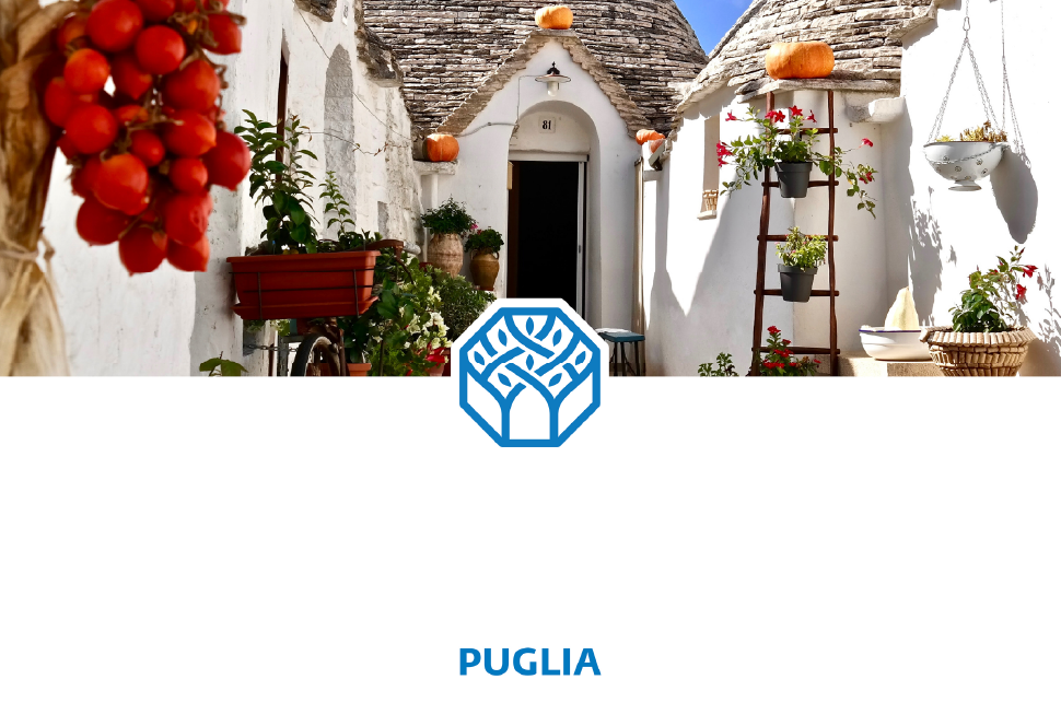
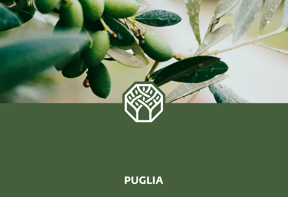
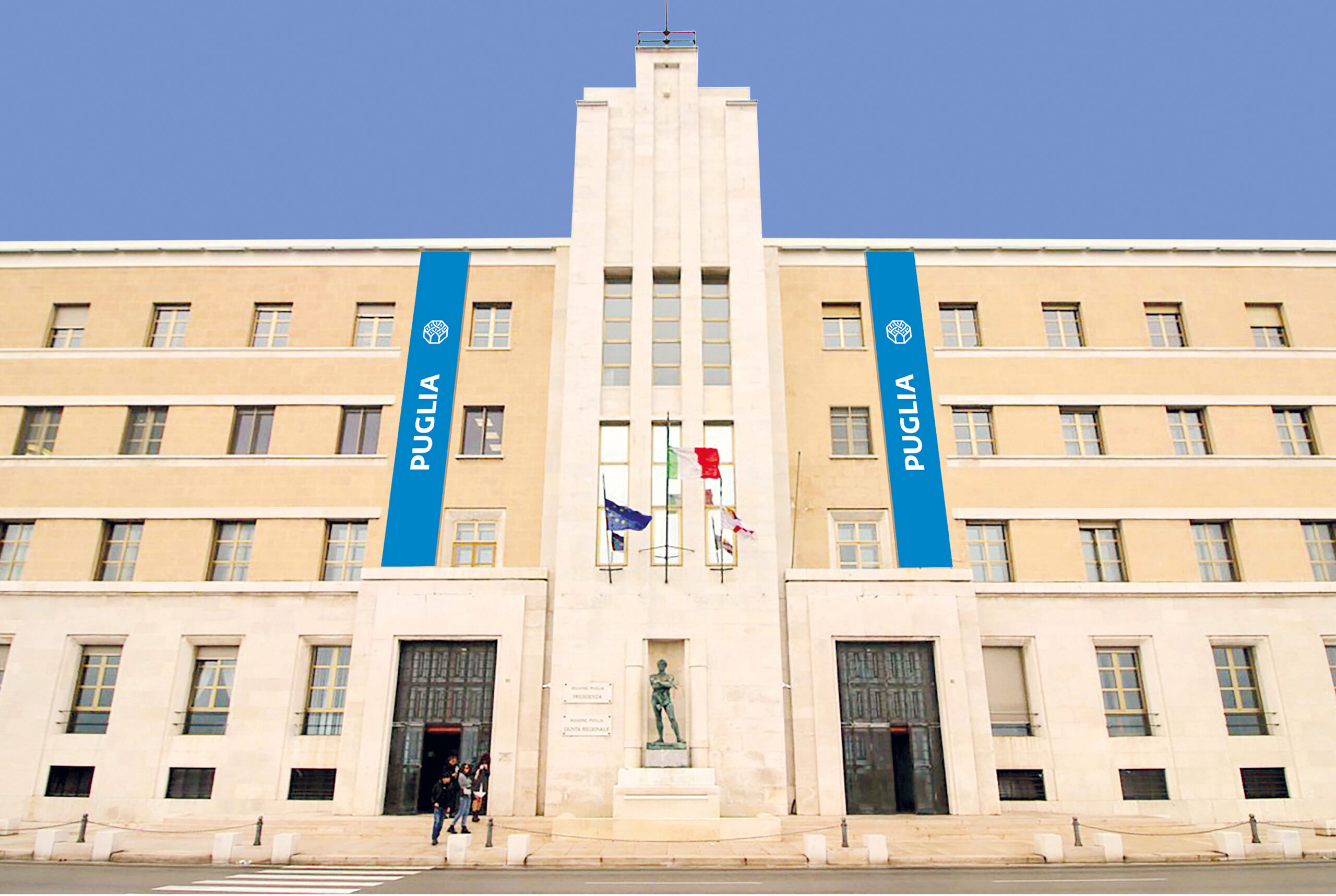
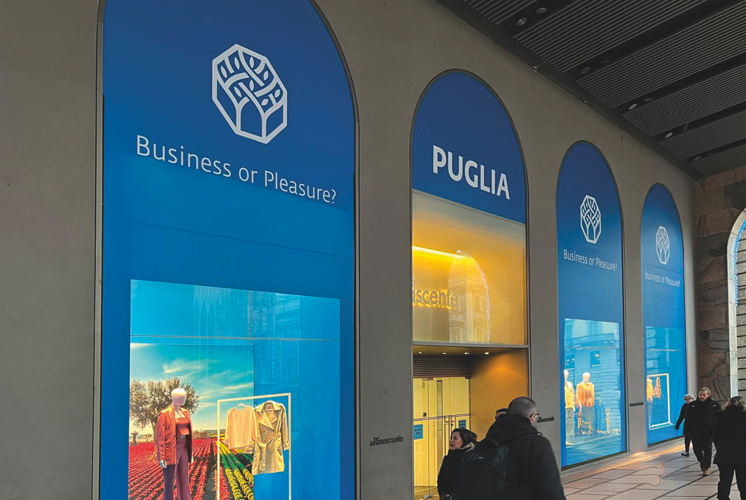
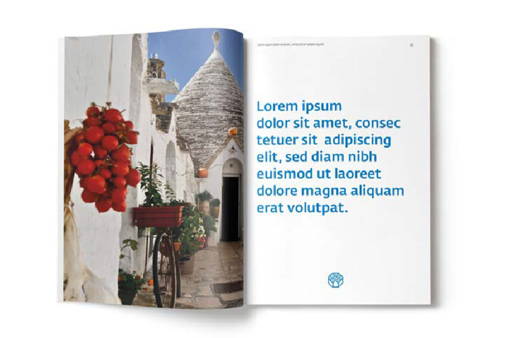
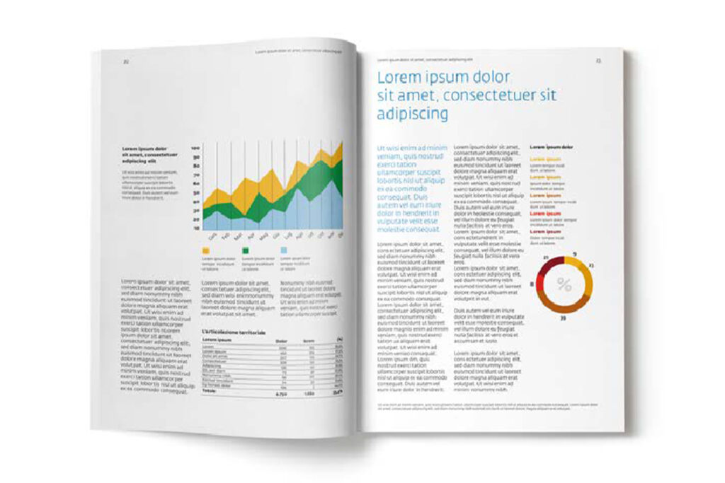
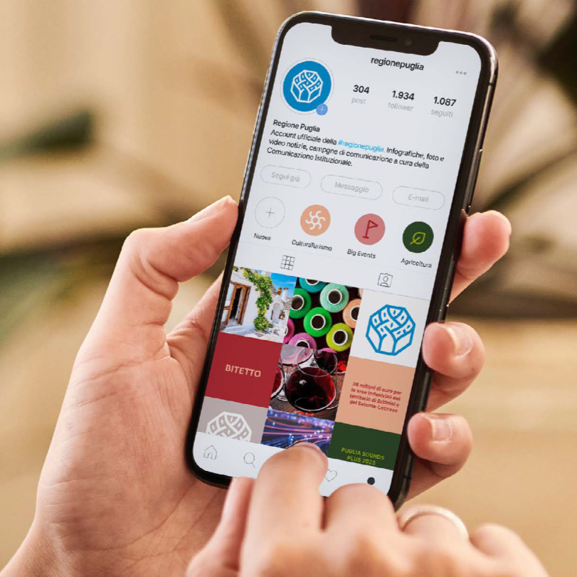
The brand language unfolds consistently across all touchpoints. Institutional publications, promotional materials, advertising, and digital devices adopt simple, modular layouts that ensure clarity and coherence. Photography highlights iconic images of the region, immediate and authentic, often paired with color backgrounds in chromatic harmony. Patterns derived from the symbol and logotype further enrich the system, characterizing a variety of applications such as backdrops, environments, and exhibition settings.