Salute Lazio
In the sign of health, in the sign of the territory
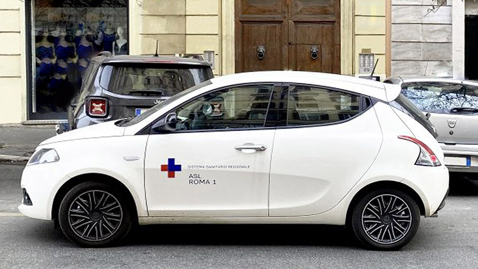
The Healthcare Service of the Lazio Region is made up of 12 local health authorities — 8 serving the city of Rome and 4 serving the provinces — divided into 55 districts. All this translates into 104 healthcare facilities, including hospital companies and centers, university hospitals, care institutes, and private structures.
Naming e Brand design. Simplification and coherence
It is a vast, multifaceted, and above all heterogeneous universe: such a layering of different entities limited the visibility and recognizability of the system as a whole. For this reason, Inarea’s primary goal was to reorganize the overall proposition by restructuring the visual relationships among all territorial facilities, in order to create a unified and coherent system of representation.
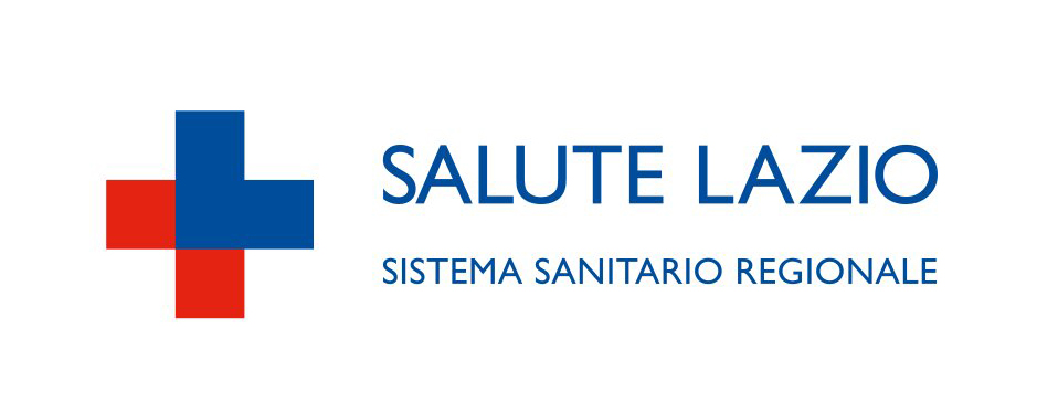
The identity system of the Lazio Region Health Service begins with the simplification of its name, reduced to the essential message: Salute Lazio, accompanied only by the specification “Regional Health System.” The symbol plays on the word “Lazio,” retaining the letter “L,” which joins with two red elements to form a shape reminiscent of the well-known red cross.
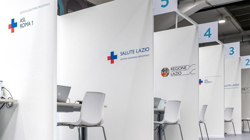
Brand architecture. From logo to system
From the logo and format came the system through which the brand “comes to life” and becomes the “signature” of the Regional Health Service in every area — from documentation and labeling to communication.
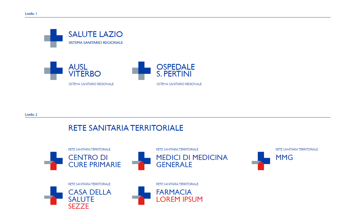
The project is founded on a single guiding principle—conceptual, visual, and communicative: a new name, logo, and identity system. The format draws on the brand’s expressive codes—its color and geometry—serving as a cohesive “container” element for the entire service. In this way, the relationship and coexistence between the “Salute Lazio” framework and the related healthcare facilities are facilitated.
Within this framework, the introduction of the “Casa della Salute,” a territorial social and healthcare network for primary care, was visually characterized as a direct extension of the master brand.