Italgas is a Network Tech Company serving Italian and European communities in the sectors of gas distribution, energy efficiency, water services, and digital technologies. Listed on the Milan Stock Exchange following its demerger from Snam, it manages over 154,000 km of networks and serves more than 12.9 million customers across Italy and Greece. Today, Italgas represents the synthesis of a century-old tradition and a commitment to innovation, sustainability, and digital transformation.
Brand identity. Renewed expertise, safety, and reliability
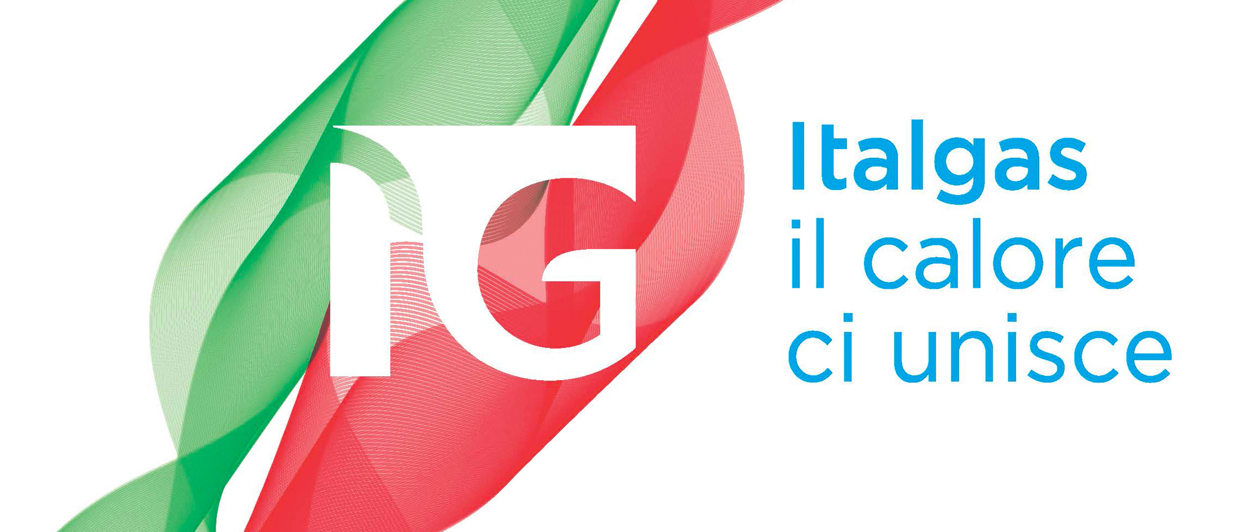
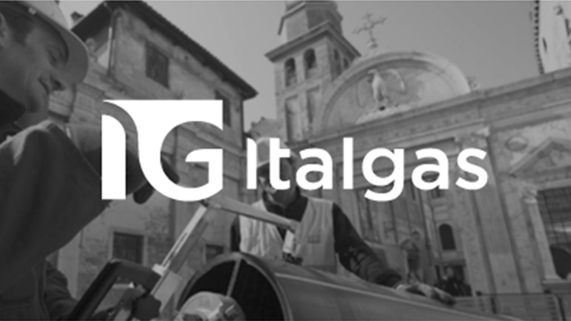
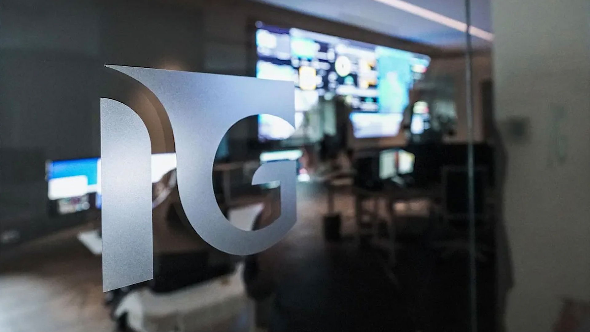
Founded in 1837, Italgas witnessed the birth of Italy and has accompanied the country throughout its development. A long history and a presence across both urban and rural landscapes have made the brand one of the most deeply rooted in the territory. Reclaiming this heritage and tailoring it for the future is the starting point for the company’s new positioning. With its new corporate structure, Italgas has adopted a brand identity centered on the IG monogram—a direct reference to its stock ticker—to build a strong and contemporary visual identity.
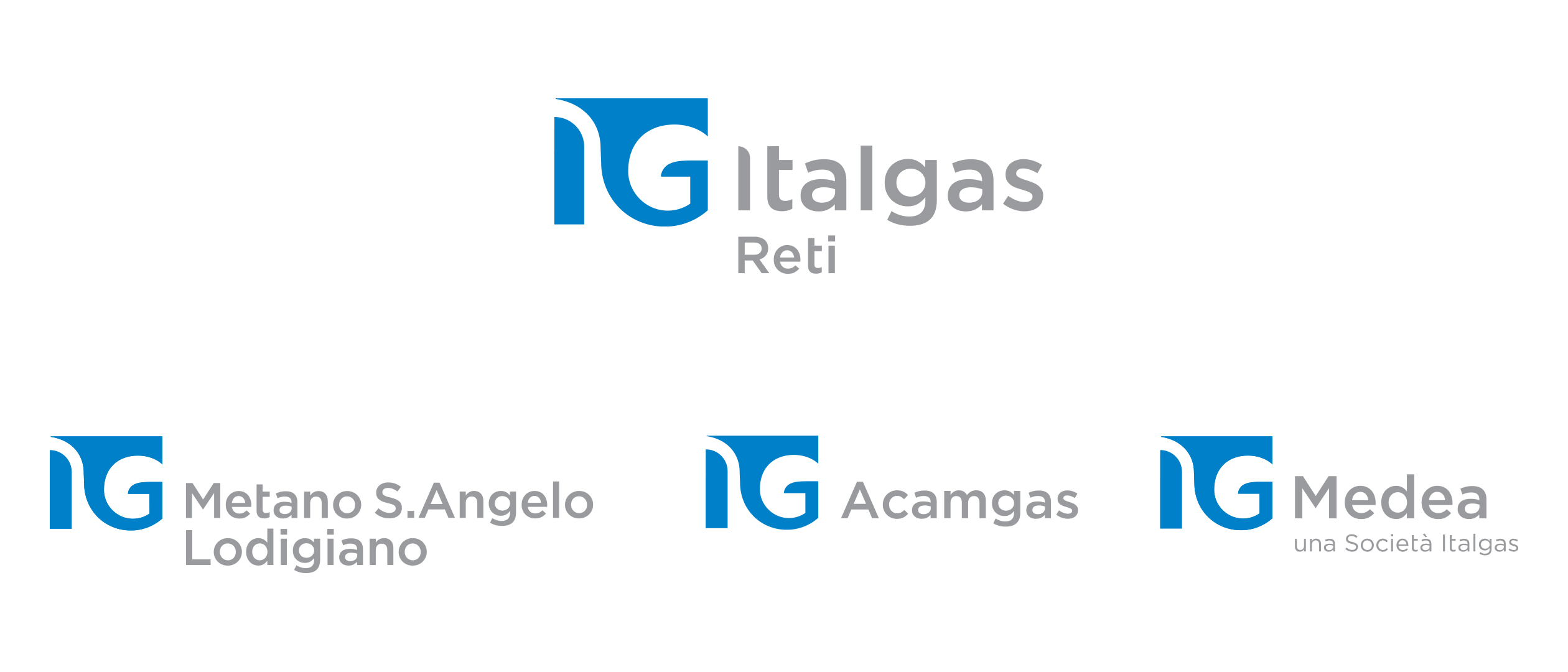
The graphic symbol is shaped like a cornucopia through which a symbolic light source moves. The open shape expresses dynamism, fluidity, and proximity, aligning with the company’s aspiration to serve as a bridge between energy and people. The color palette draws on the traditional colors of the company and natural gas, with a modern twist reflecting a technologically advanced firm ready to face a new phase of its history. Furthermore, IG becomes a distinctive symbol not only for Italgas but also for its subsidiaries and affiliates, ensuring brand recognition throughout the entire system.
Communication Design. Connecting energy and people
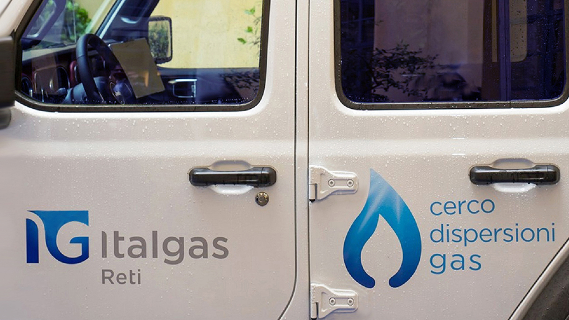
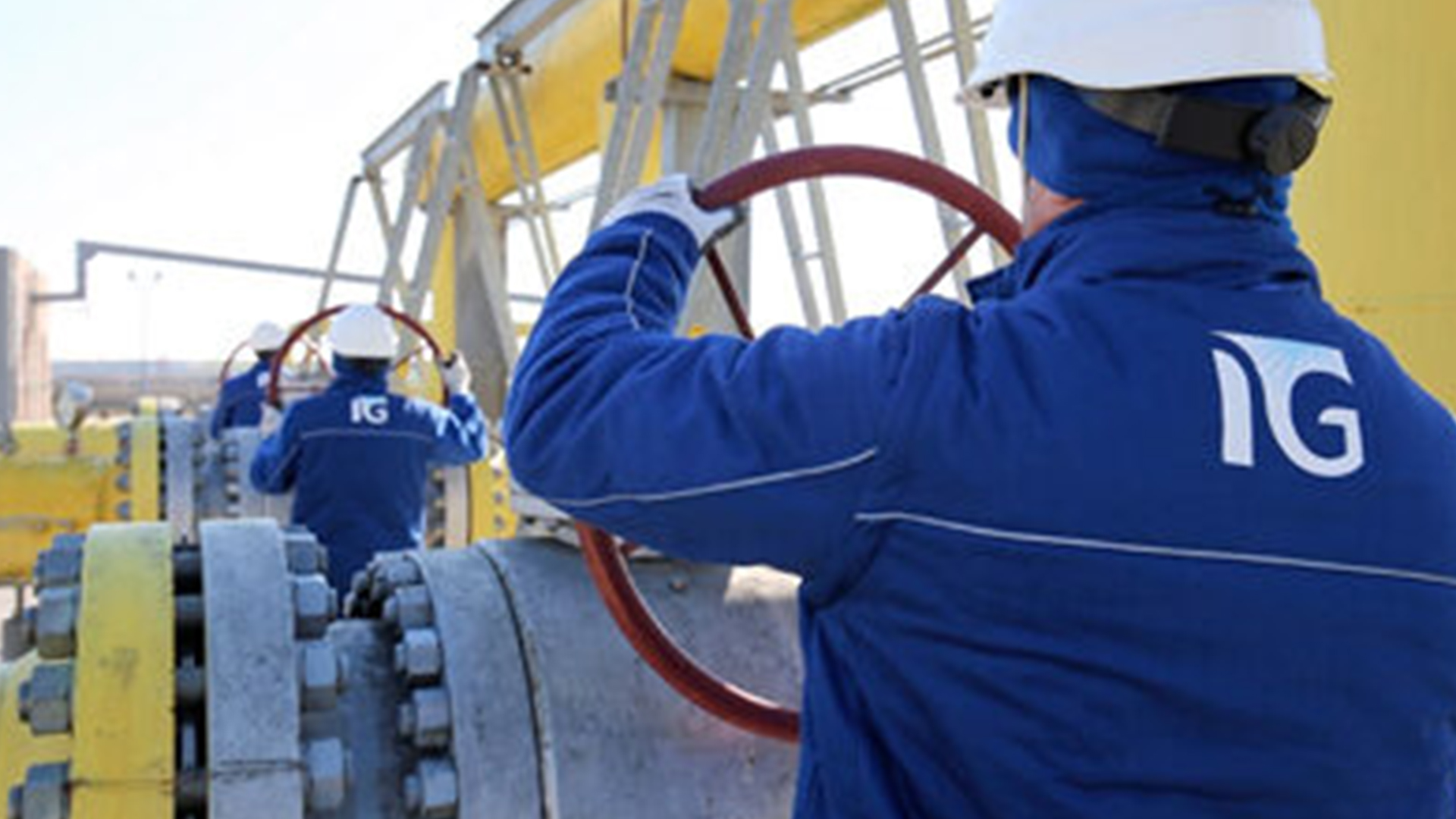
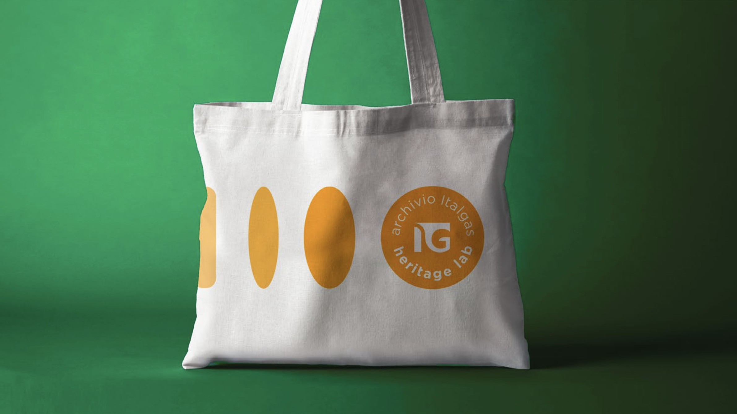
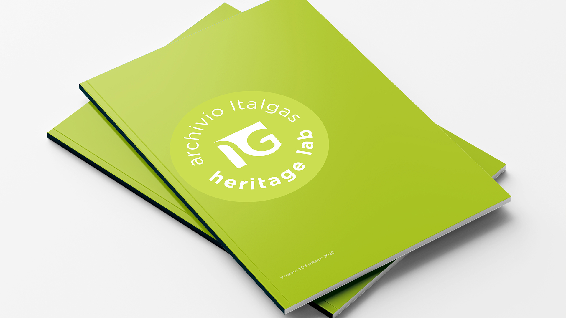
Italgas’ communication touchpoints are multifaceted: press and digital campaigns, social media, merchandising, company vehicles, institutional materials, print publications, and corporate assets.

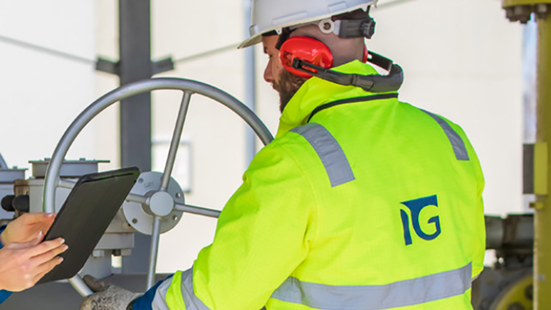

The communication tone is consistent: values such as reliability, sustainability, expertise, and innovation are conveyed not only through words but also through visual identity, photography, colors, and typography. Dynamism, fluidity, and proximity remain consistent with the company’s role as a bridge between energy and people.