Improda
Shaping the value of companies
Improda is an organisation that combines legal expertise with strategic vision. On one side,
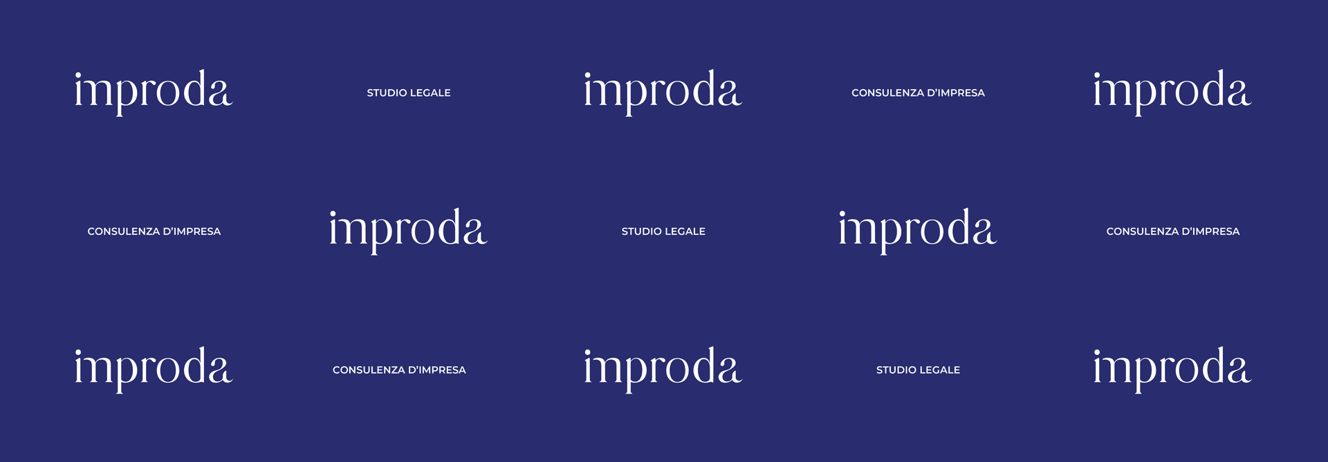
Brand identity and brand architecture. From surname to brand.
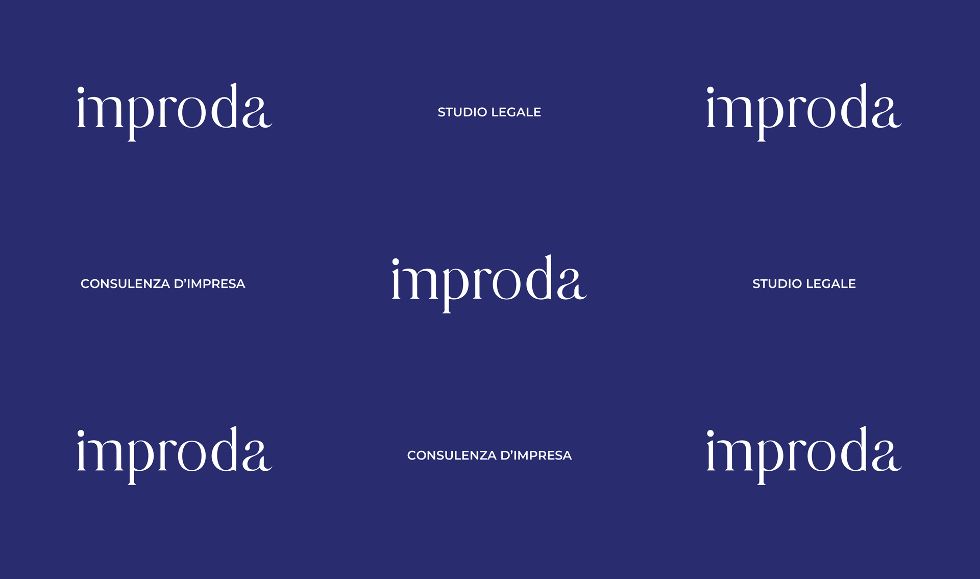
The rebranding project was created to give shape to a new phase in Improda’s history, marked by the transition from the founder’s surname to a brand. The strategy translated the firm’s two areas of expertise — legal and consulting — into a value-driven positioning, “we shape the value of businesses,” which expresses the ability to transform the intangible into the tangible. From this perspective, the brand architecture defines a single brand, Improda, which serves as an umbrella for the two complementary entities. “Law Firm” and “Business Consulting” become descriptors that specify the two areas of activity.
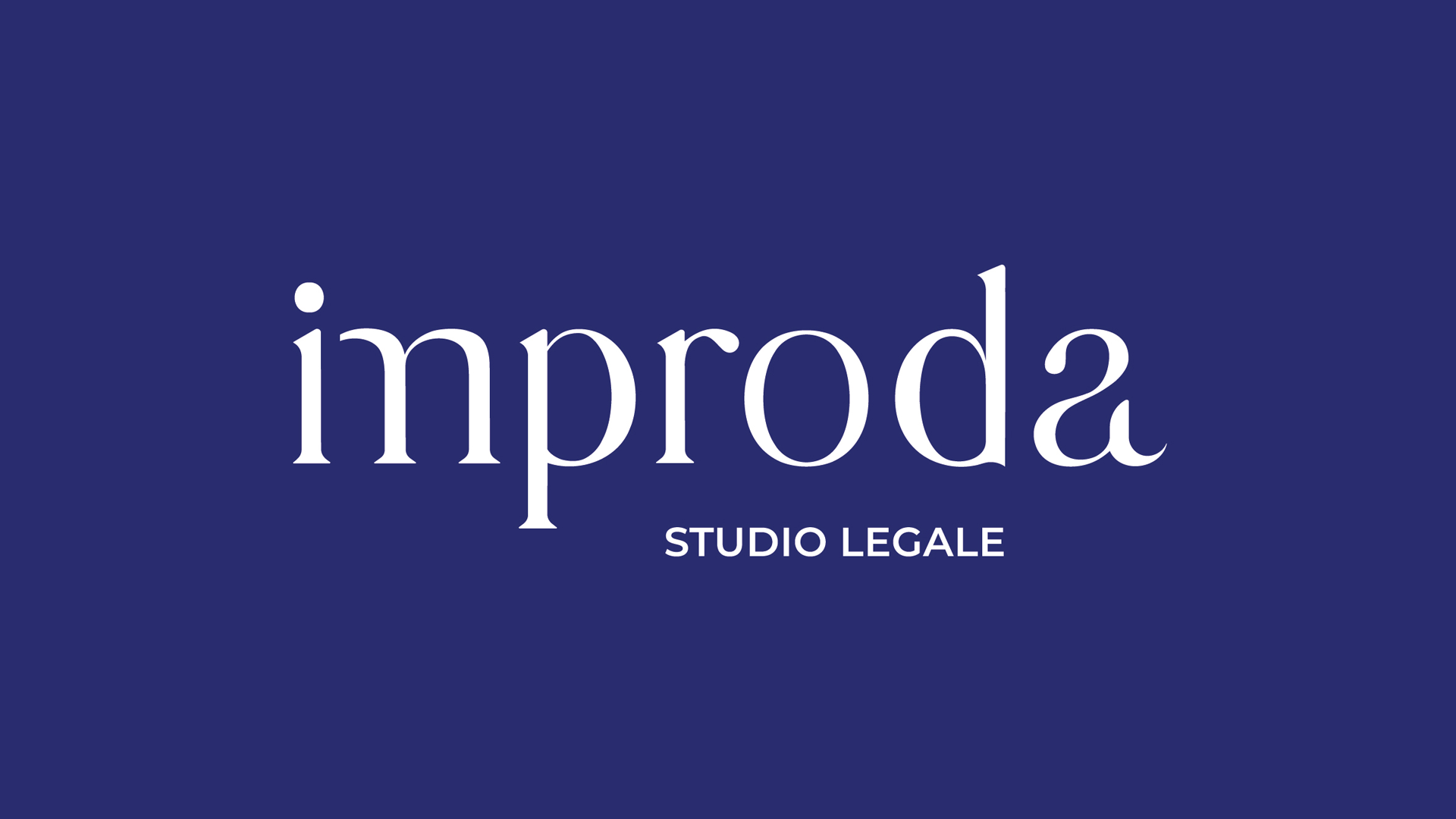
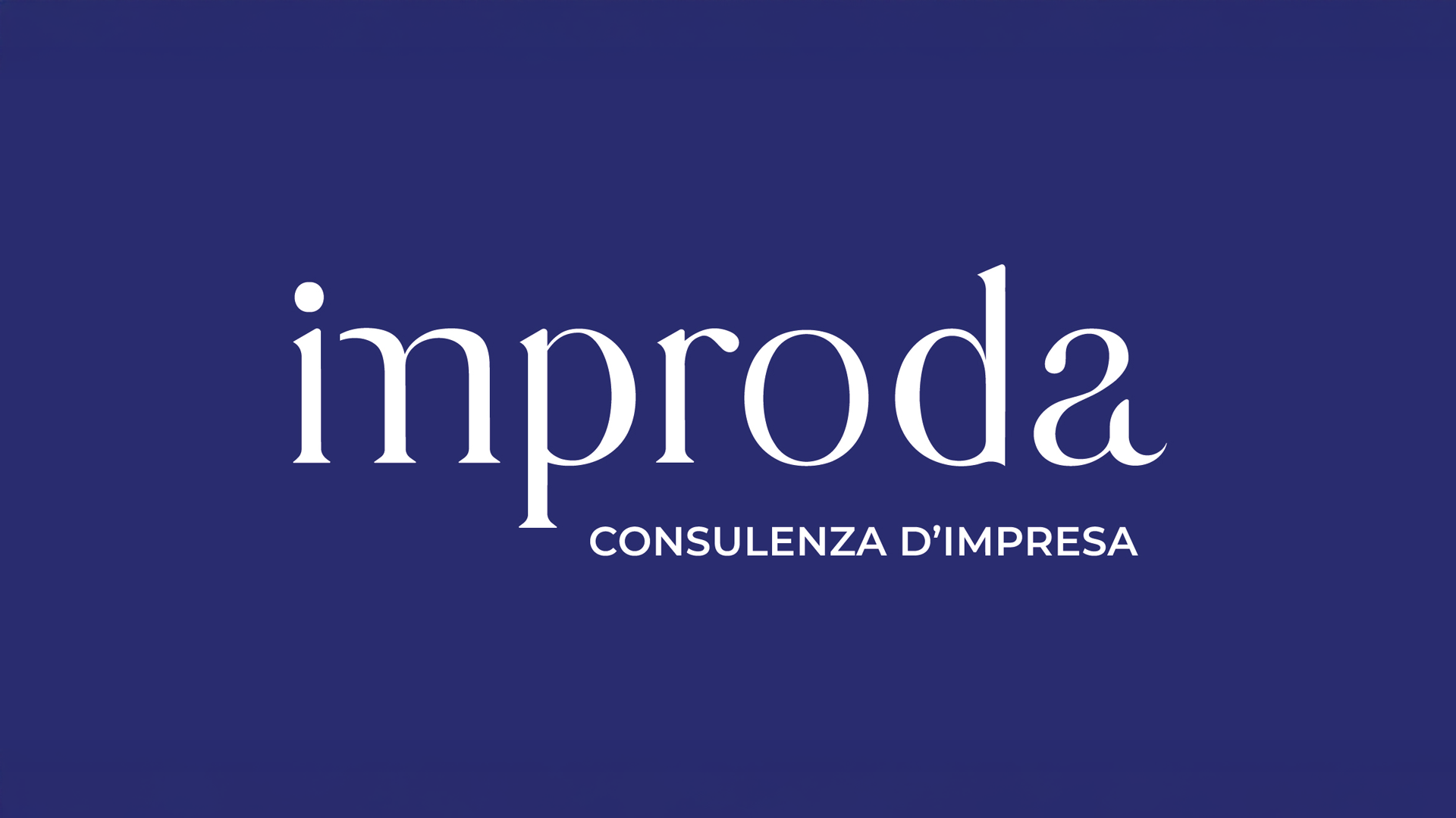
Brand design. When the word becomes a sign
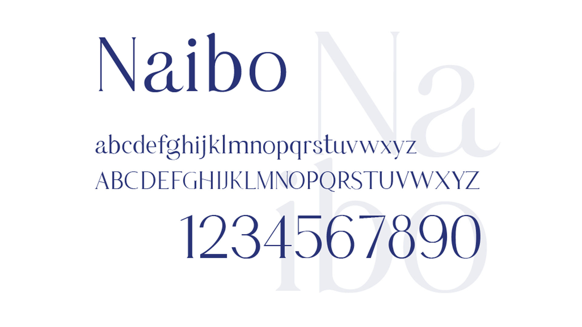
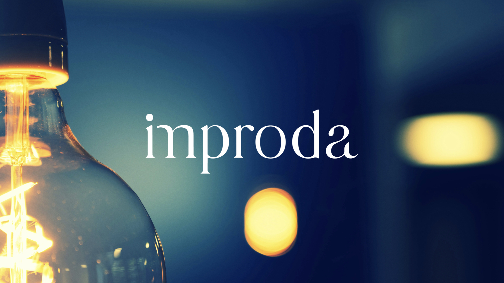
The “Improda” logotype was created from the need to give visual form to the word, the fundamental element of every relationship. The typographic choice, based on the Naibo typeface, conveys a balance between rigor and humanity. Its distinctive feature is the cut “M,” brought closer to the initial “I,” suggesting continuity and synthesis, while the open final “A” symbolizes accessibility and openness to the outside world. The result is an identity that communicates trust and closeness, distancing itself from the traditional codes of classic law firms.
Editorial and communication design. A grammar of shapes
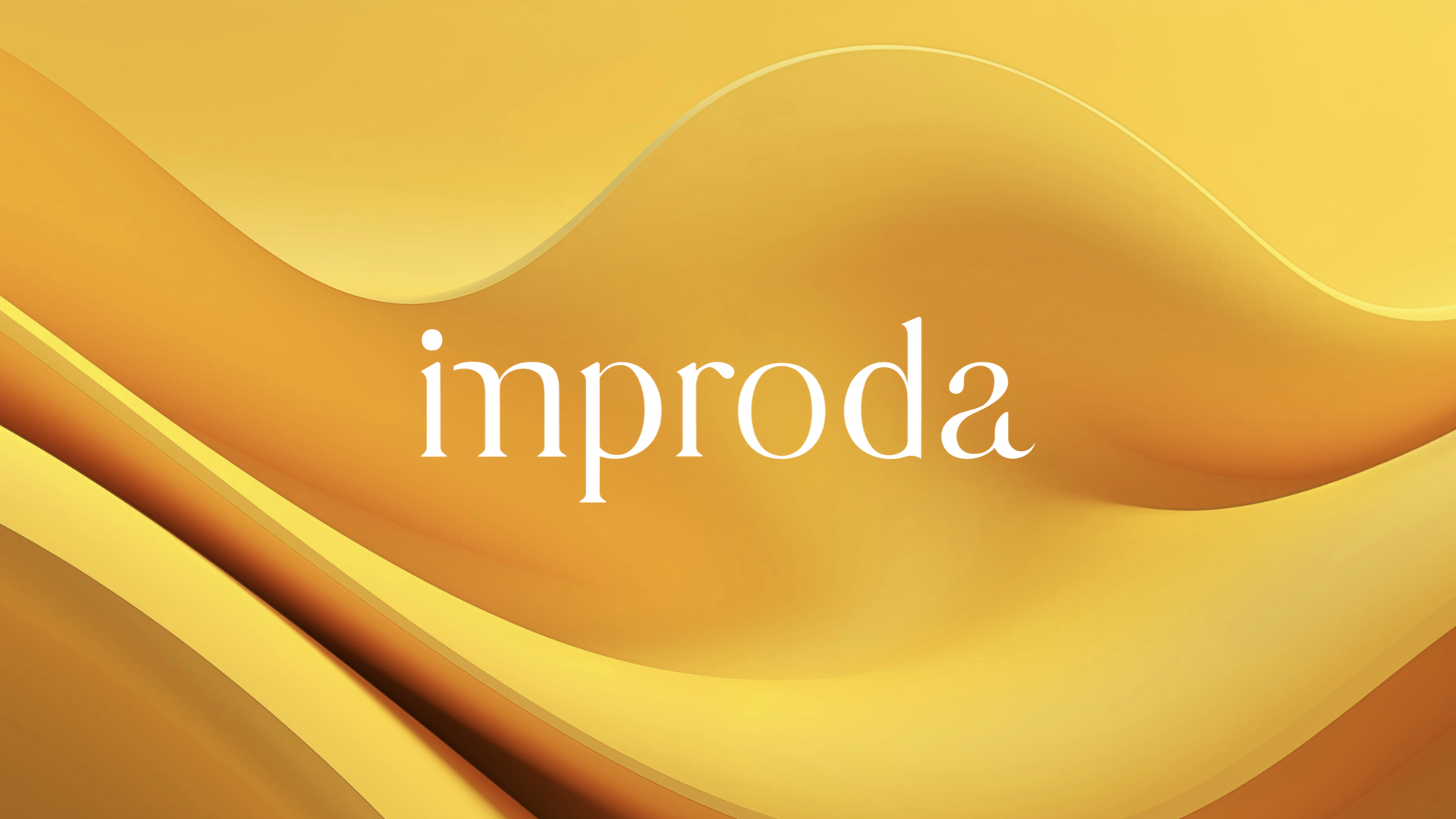
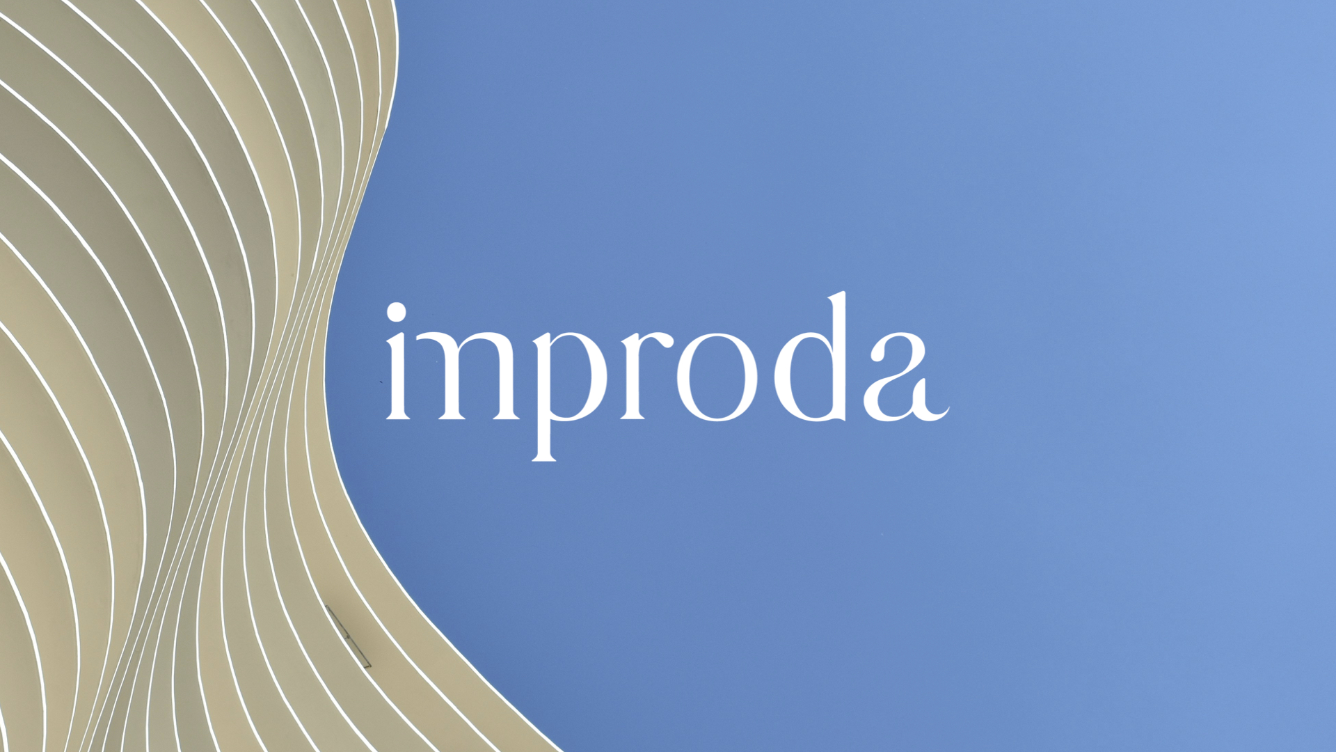
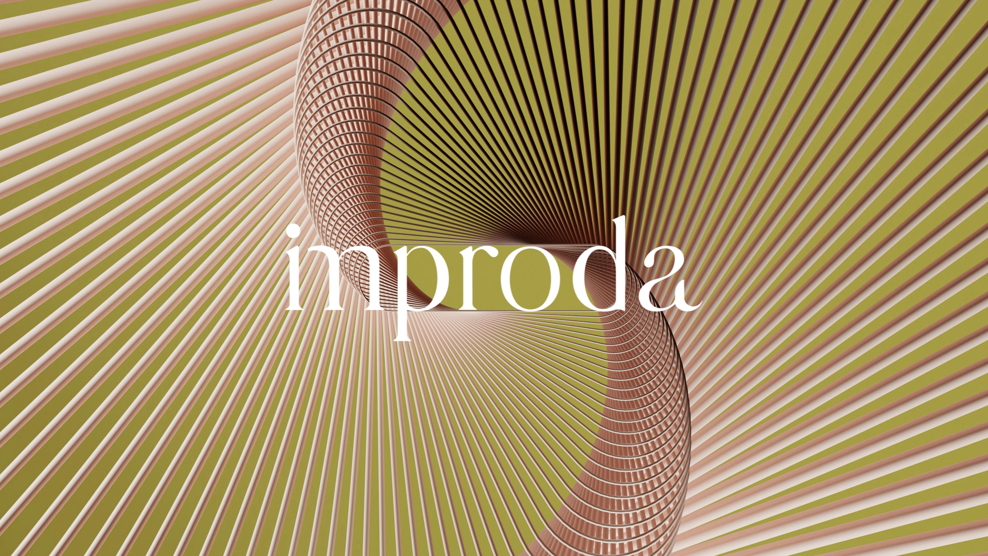
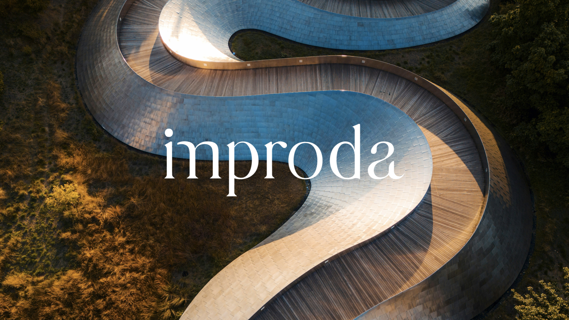
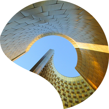
The brand’s languages are built on a grammar of forms: curves, lines, and sinuous geometries that give coherence to the various communication tools. In editorial applications — from the website to printed materials — image and word interact, carving out reciprocal spaces. The photographs do not describe but evoke: abstract shapes, droplets, soft surfaces that recall the idea of transformation. The tone of voice is direct and contemporary, an expression of an authentic, relationship-driven approach.


Video & motion design. Evocative synthesis
The institutional video distills the brand’s vision: “we shape the value of businesses.” From images of hands drawing, shaping, and creating, the narrative shifts to abstract scenarios where the intangible takes form through communication. The key words — trust, relationship, expertise, value — accompany a story that blends concreteness with inspiration. The final logo animation completes the visual journey: the form gradually comes together, like the value that emerges from the dialogue between law, consulting, and enterprise.