The Cotarella Foundation was established in 2022, stemming from an entrepreneurial and human journey rooted in the regions of Tuscany, Umbria, and Lazio. It works to support initiatives focused on food well-being, the rediscovery of local territories, and sustainable agriculture, engaging in dialogue with families, communities, institutions, and businesses.
Brand Identity and brand design A family that becomes a community
“Cotarella” is a name that needs no introduction in the international wine world. The first generation founded the company, while the second made wine culture its mission—enhancing wine labels and working as consultants within the industry. The Foundation was born from the third generation’s desire to elevate these experiences into a new and meaningful journey
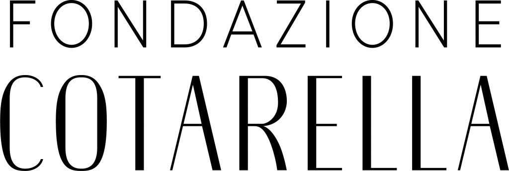
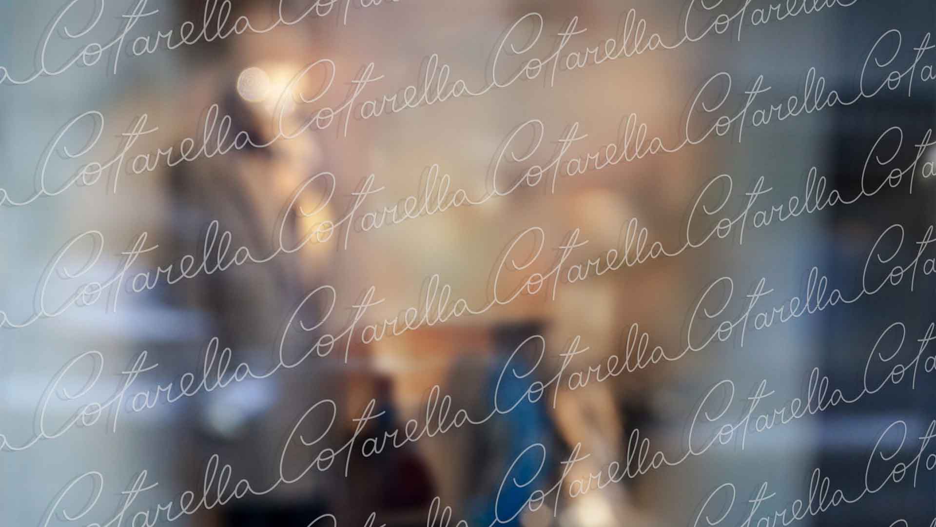
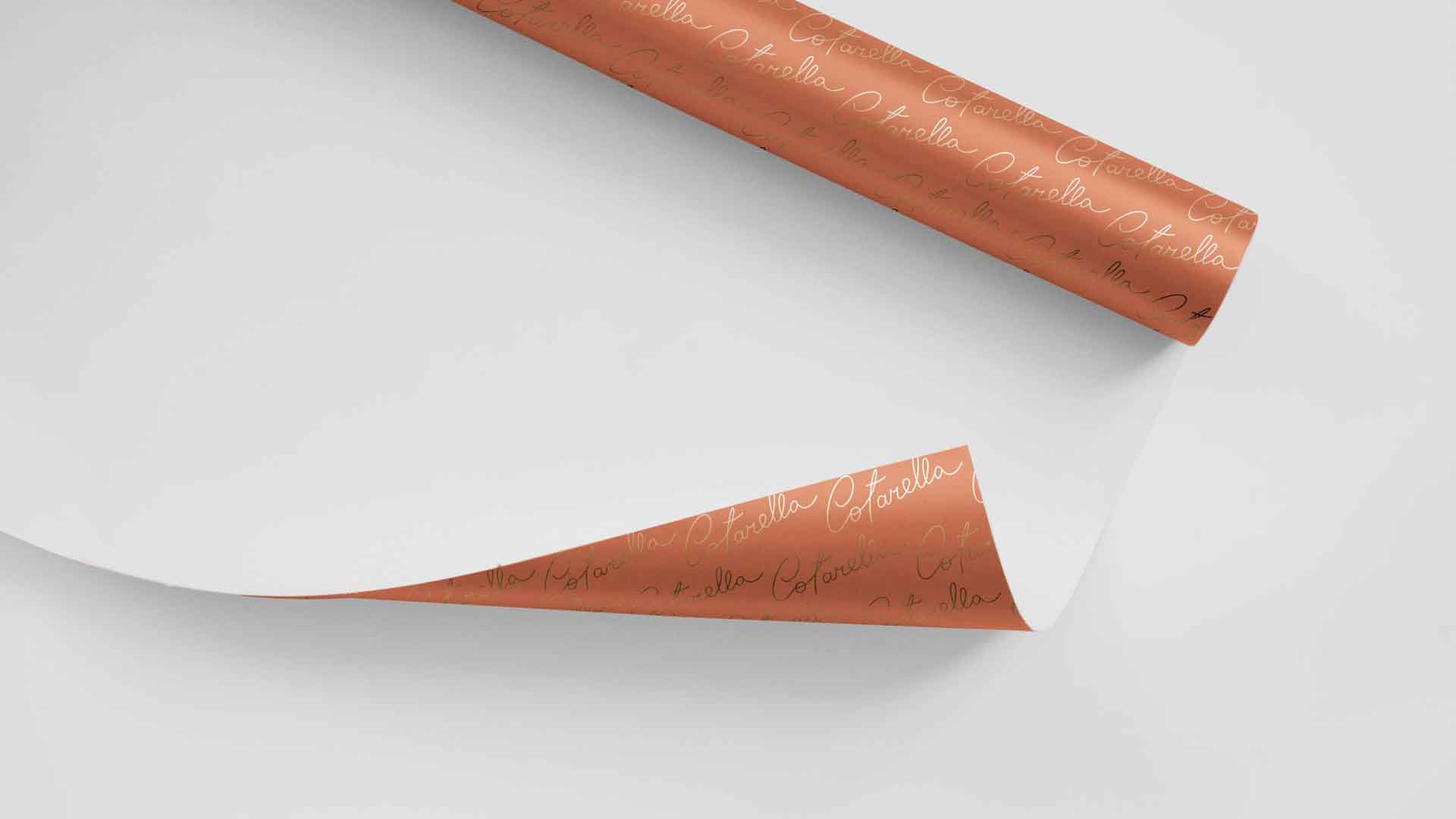
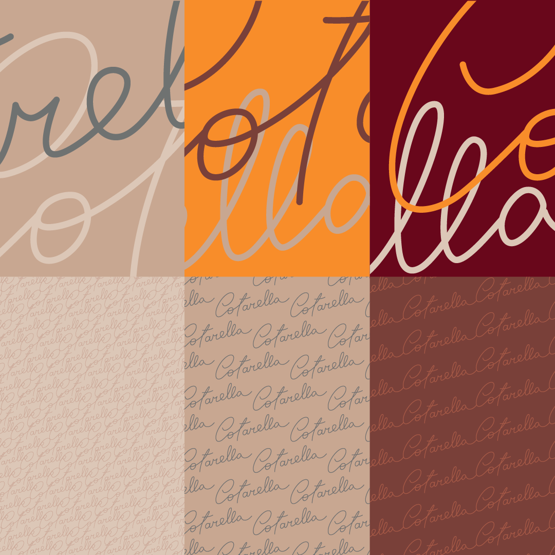
Inarea’s work was based on the premise of translating this idea of family into a community that is deeply rooted in a specific geography. The identity system is designed to strengthen this very principle of rural solidarity—a network that first and foremost means proximity—reframing it within a contemporary dimension. The logotype is inspired by the lettering used on the wine labels, now reinterpreted with a sense of formal rigor and elegance appropriate to an institutional context. “Fondazione Cotarella” is elongated and refined, playing on the contrast between solid and negative spaces.
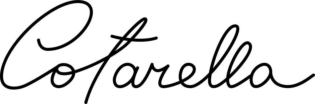
The signature, by contrast, is drawn from the original autograph of the company’s founder. While remaining faithful to the original stroke, the redesign ensures a more fluid reading of the name and, above all, becomes the guiding thread of the present. The first generation is both the background and the foundation of the new narratives, and for this reason it animates the patterns and textures of the communication materials.
Communication design Dalla firma al racconto visivo
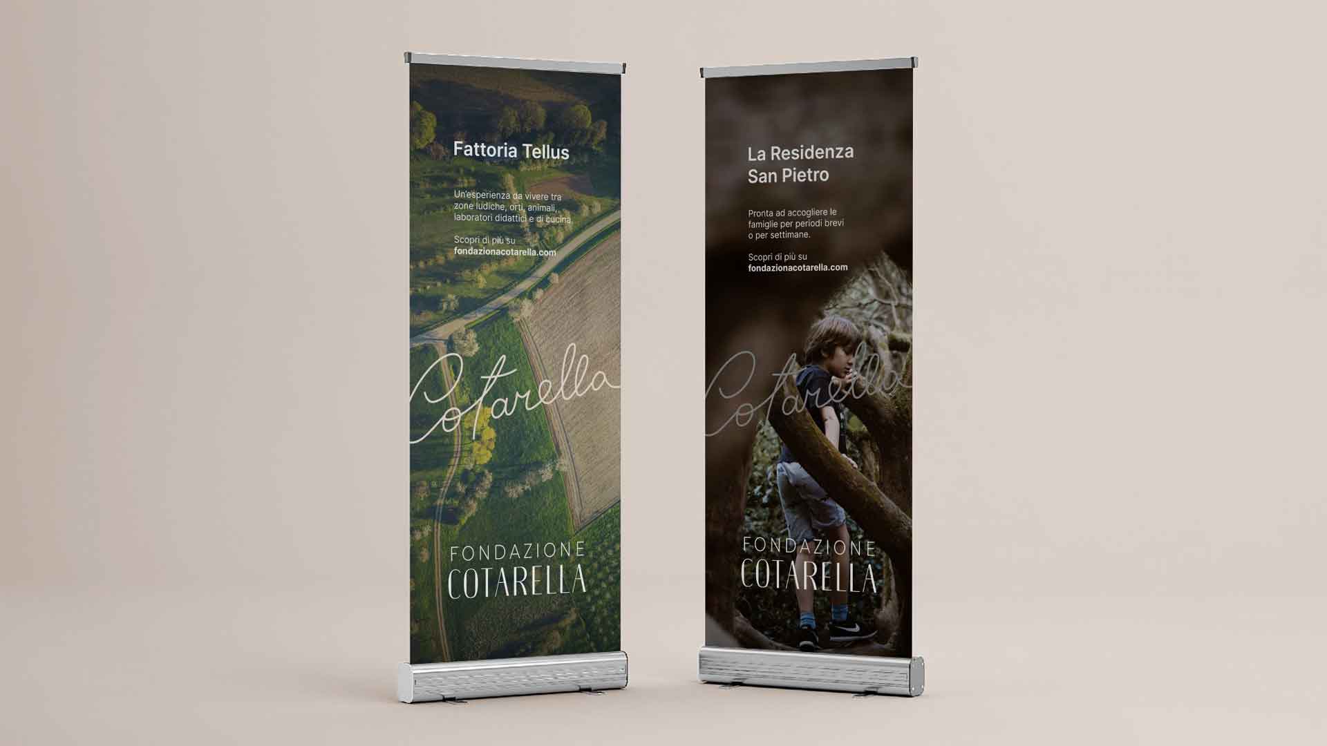
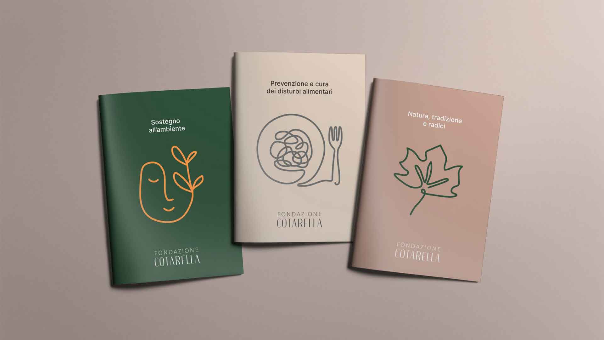
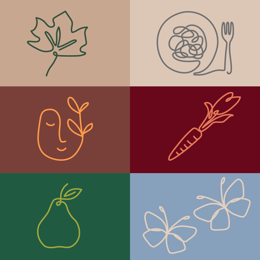
From the same line that traces the signature, illustrations and pictograms also unfold, offering a simple, familiar, and iconic narrative of the Foundation’s activities—namely, the culture of health, social connection, and the land. Broad themes are conveyed through concrete symbols, easily understood by any audience.
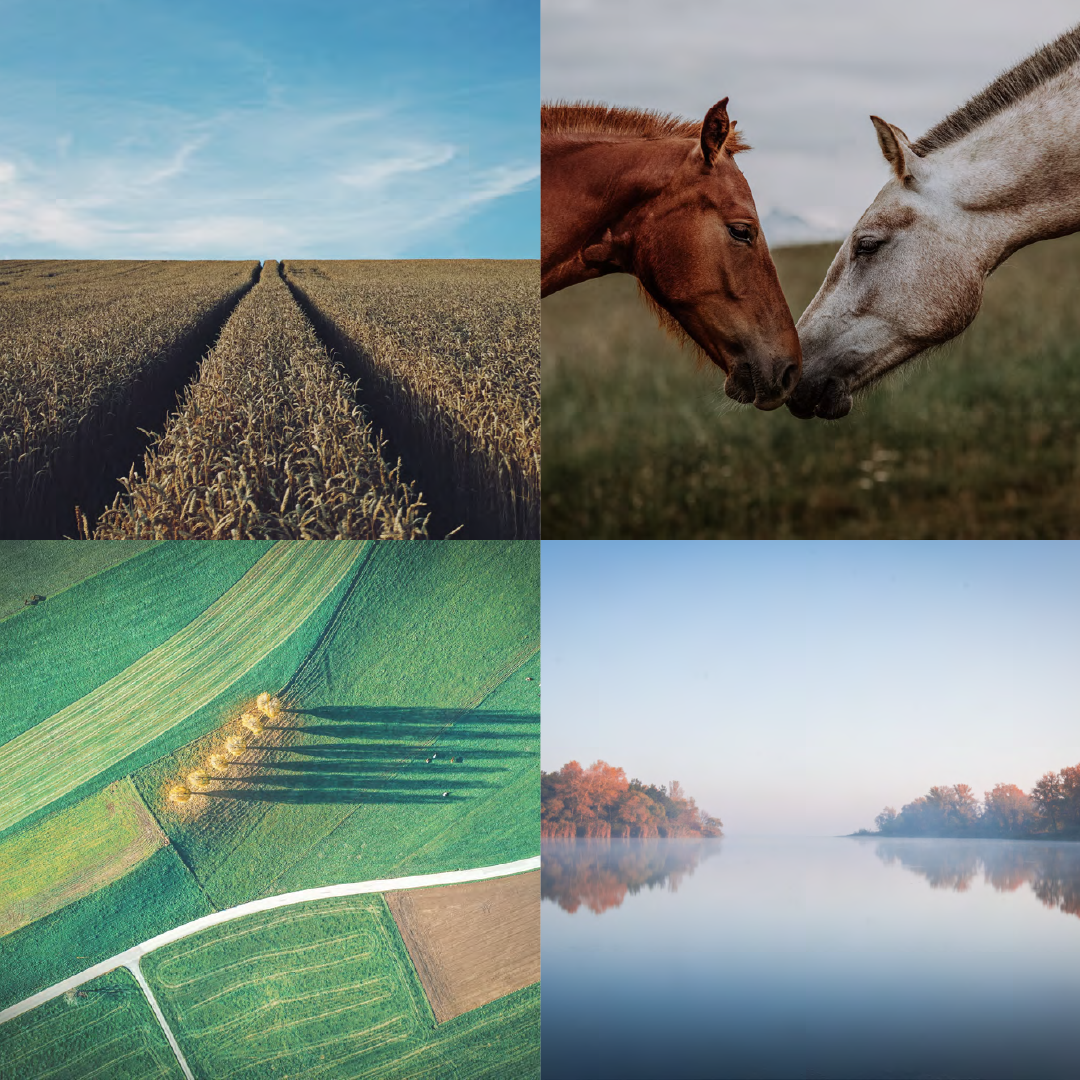
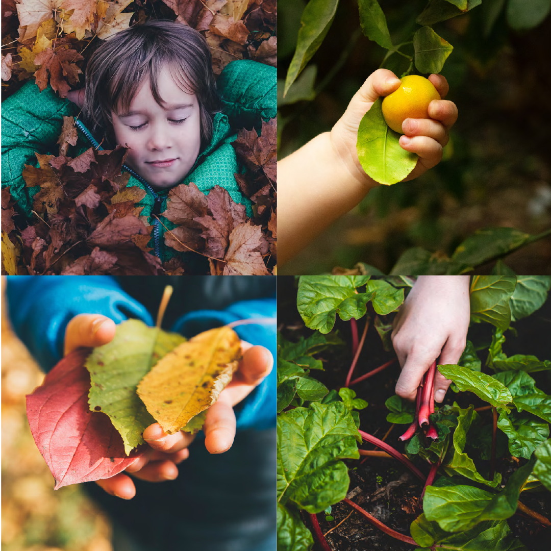
Finally, the photographic style both narrates the land and its products and highlights the rediscovery of the people who live, work, and put down roots there.
Video & Motion Design. Identity in motion
Video and logo animation translate the Foundation’s identity and values into dynamic imagery, bringing to life content that tells stories of land, community, and well-being. Through motion graphics, movement becomes a language for communicating emotion and meaning in an effective, contemporary way, strengthening the bond between visual storytelling and brand identity.