

Fondazione Cariplo is the leading philanthropic organization in Italy and one of the most important in Europe. Its mission is to promote and support projects that place the common good, human development, and the collective interest at their core. Established in 1991, its origins date back to 1816, with the founding of the Central Commission for Charity, followed by the Savings Bank of the Lombard Provinces.
Brand identity The monogram that unites
The rebranding of Fondazione Cariplo bears a collective signature, born from the collaboration between Politecnico di Milano and Inarea.
Inarea worked on the concepts proposed by around ten university students coordinated by Professor Francesco Zurlo, nurturing their insights and strengthening their analyses and visual languages, ultimately producing three solutions that were submitted to the Foundation’s evaluation committee.
A shared and participatory approach, in which Inarea acted in an advisory role.
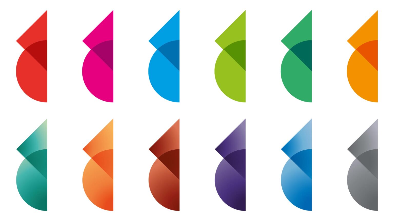

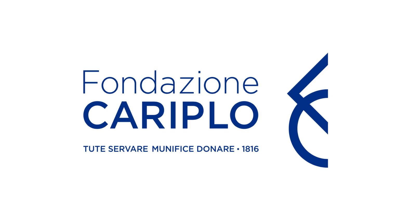
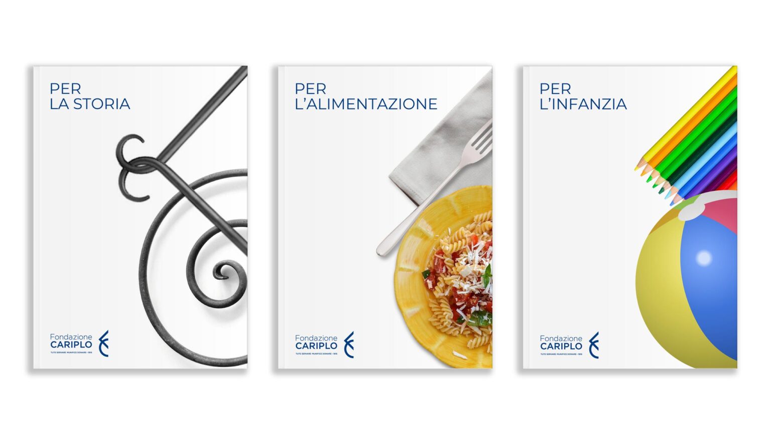
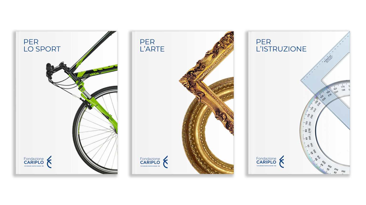
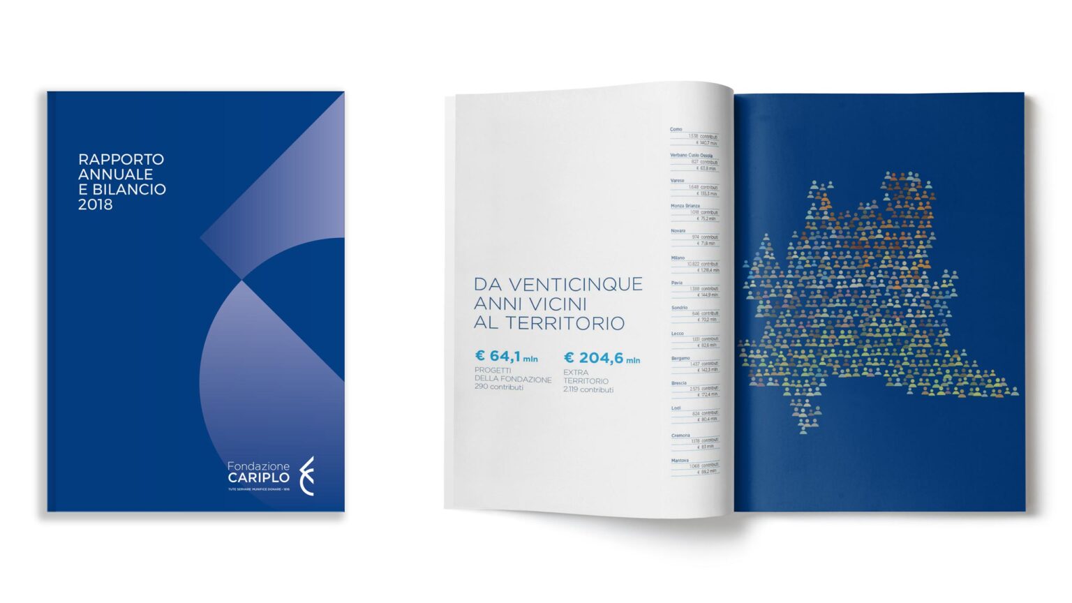
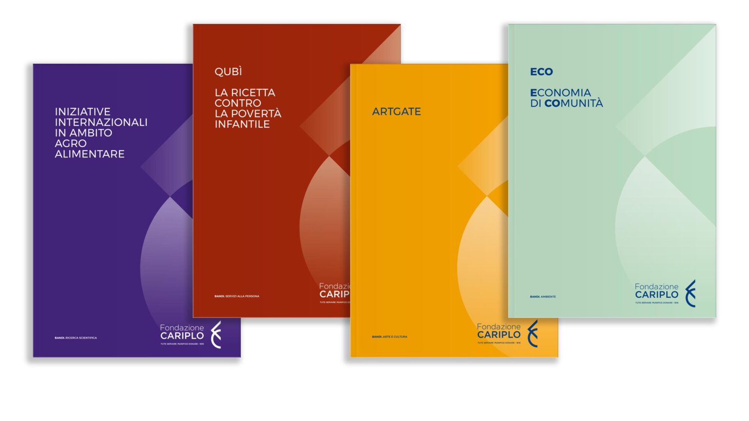
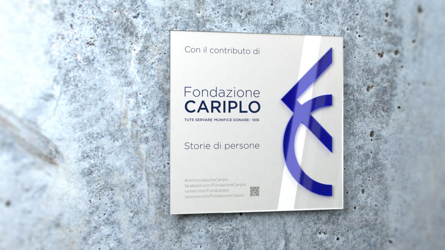
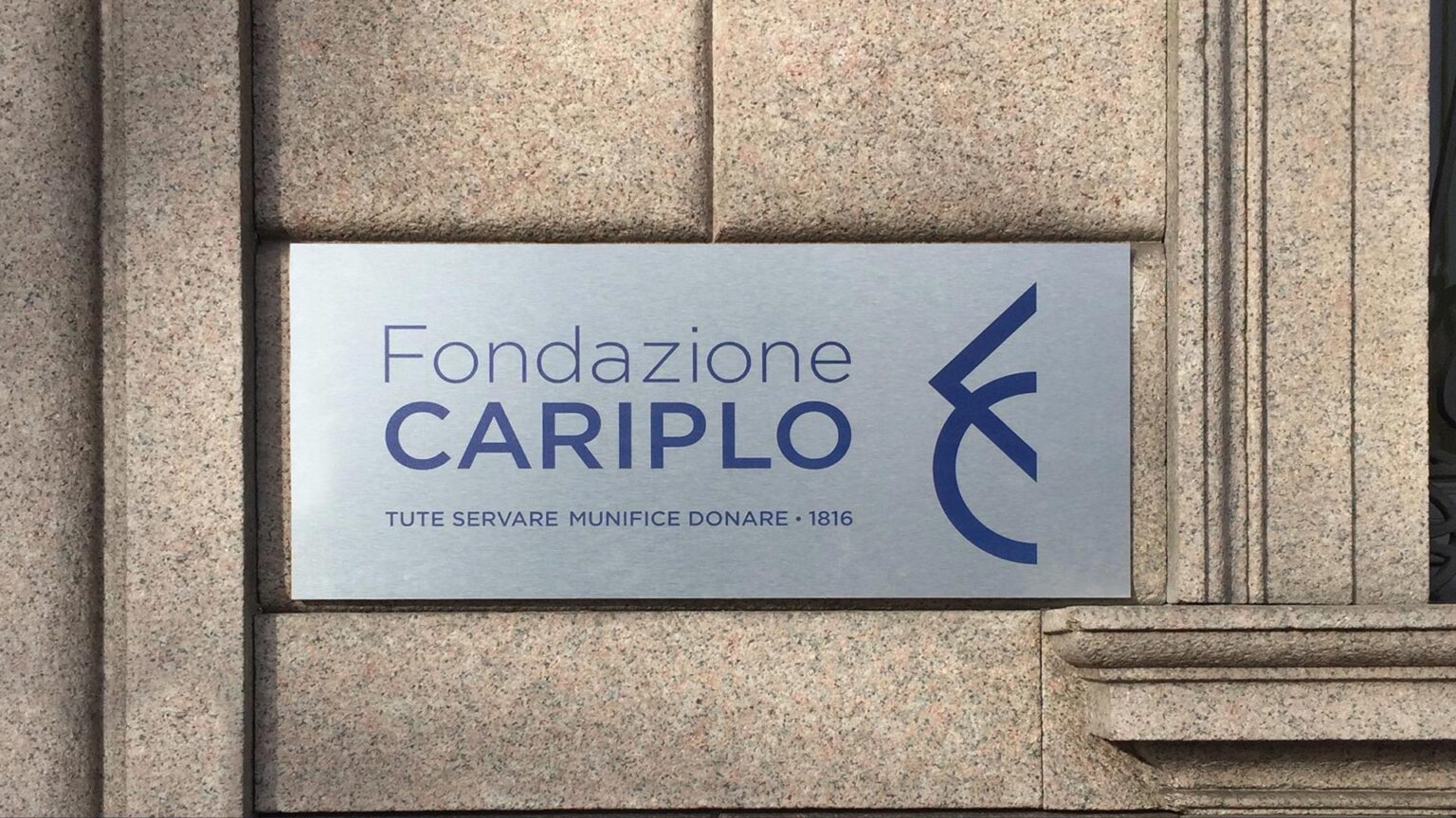
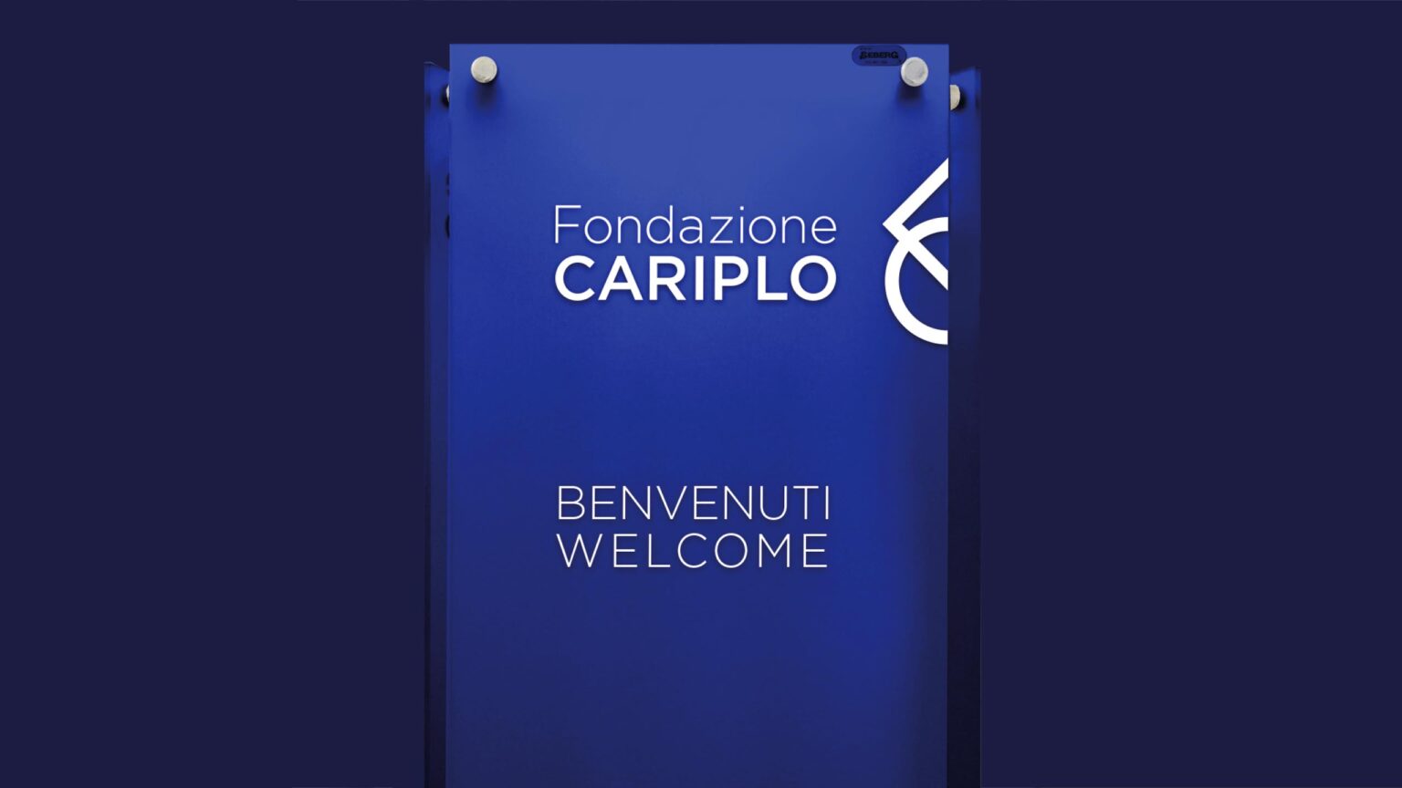
The primary visual element of Fondazione Cariplo is the FC monogram, which makes its activities more coherent and instantly recognizable. It is always paired with the full name, but its visual prominence takes precedence.

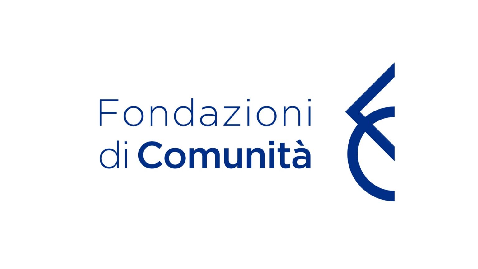
Brand design for Community Foundations. Philanthropy in the local area
In 1998, Fondazione Cariplo launched the Community Foundations project, creating active local players that promote philanthropy and a culture of giving within their territories.
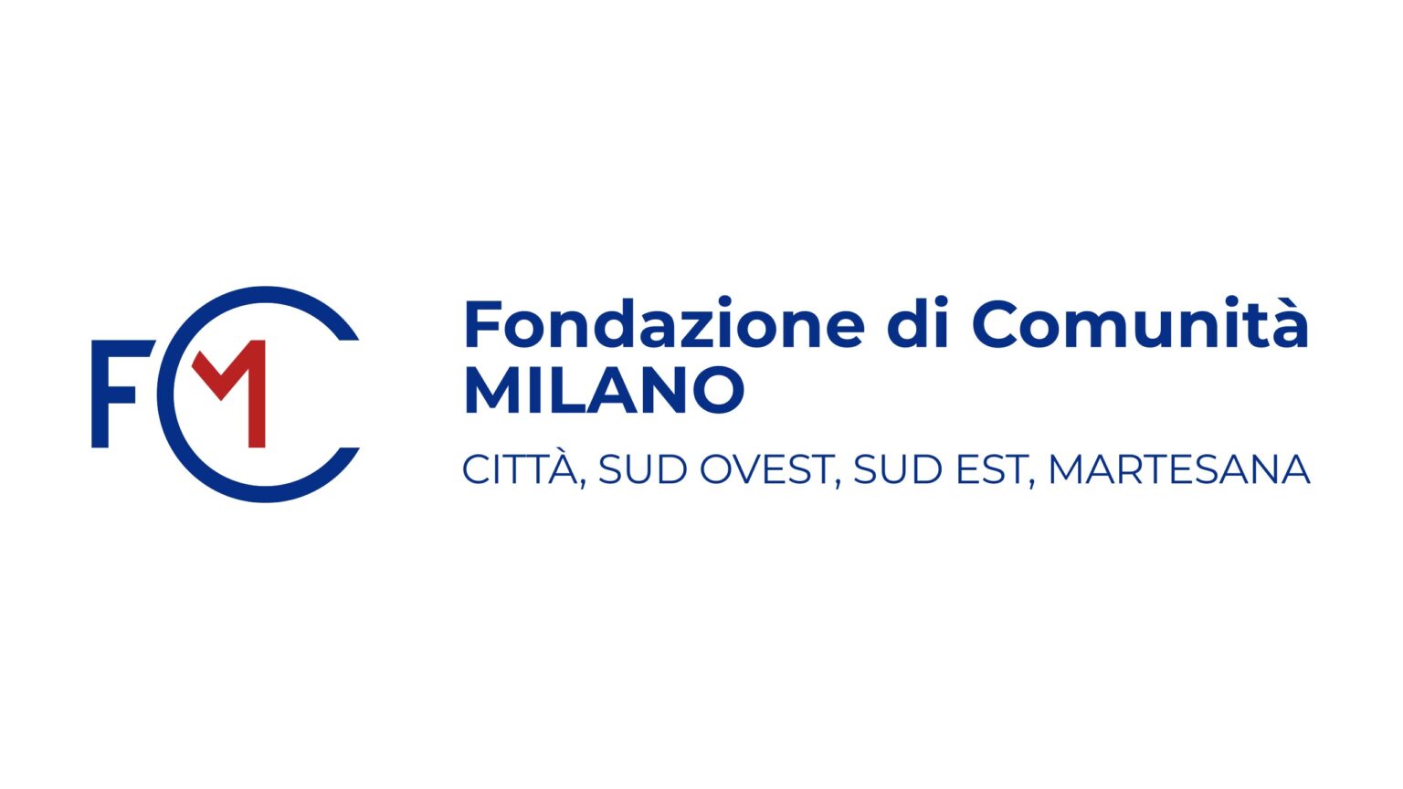
Among them, the community served by the Fondazione di Comunità Milano Città Sud Ovest, Sud Est, Martesana comprises more than two million people living in the city and in 56 municipalities across its metropolitan area. The acronym FCM, which accompanies the Foundation’s name, was designed by emphasizing the “C” as an element that conveys the sense of welcome of a community embracing part of the city. An extremely pared-down style, based on a sans-serif typeface that echoes the one used for Fondazione Cariplo, as does the use of blue. The letter “M,” in red, is instead a tribute to the identity of the City of Milan.