Edison is one of Italy’s leading energy companies. Founded in 1884 as the country’s first electricity company, it now operates in the fields of electricity, natural gas, and energy services. The company is active across the entire value chain—from production to sales—with a strong commitment to sustainability and the energy transition.
Brand identity. Rethinking itself for a new market
With the return to a liberalized electricity and gas market in the 1990s, Edison felt the need to redefine its role and positioning. The rebranding process, launched in the early 2000s, was conceived to communicate an identity more aligned with the new competitive landscape. This transition involved moving away from the identity references that had characterized the broad and diverse Montedison universe for three decades.
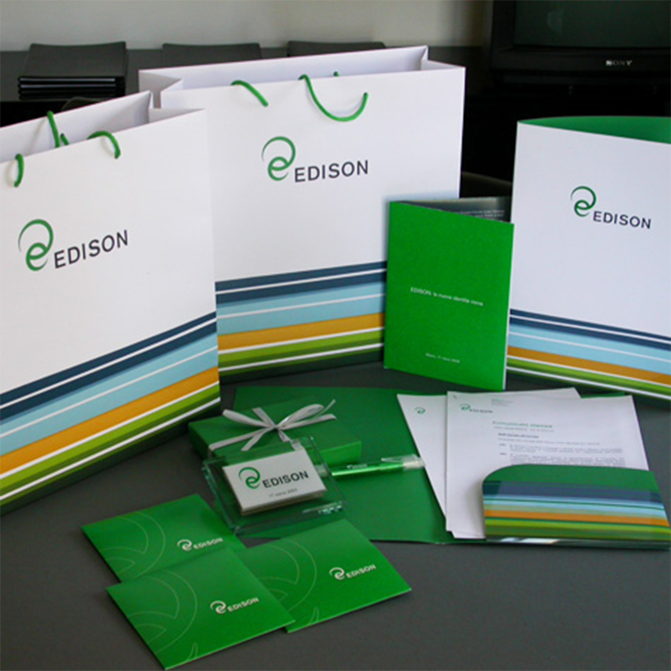
The brand identity, launched in 2003 by Inarea, focused on key values such as dynamism, innovation, responsibility, and environmental awareness—elements that reflected a vision, at the time still far from widespread, of energy as an essential and sustainable resource.
Brand design. Shapes that generate energy
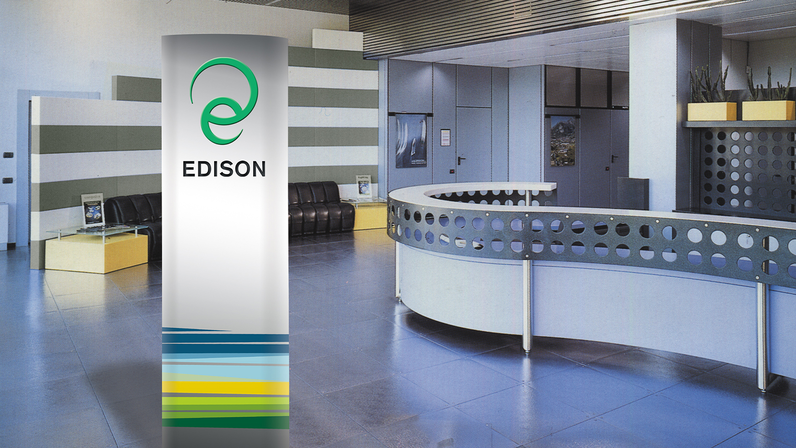
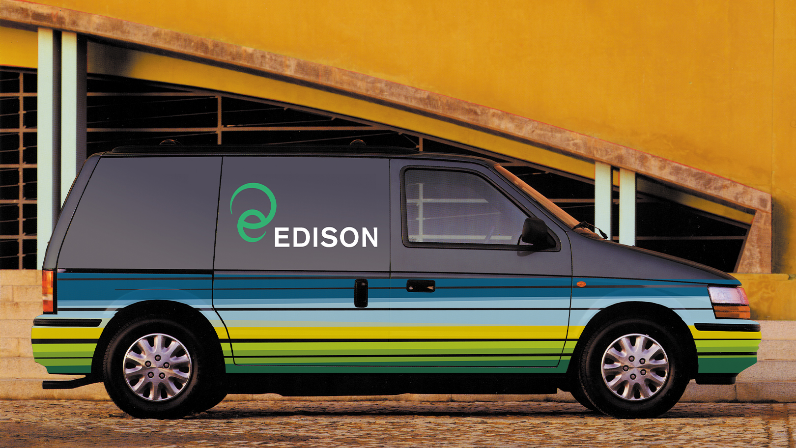
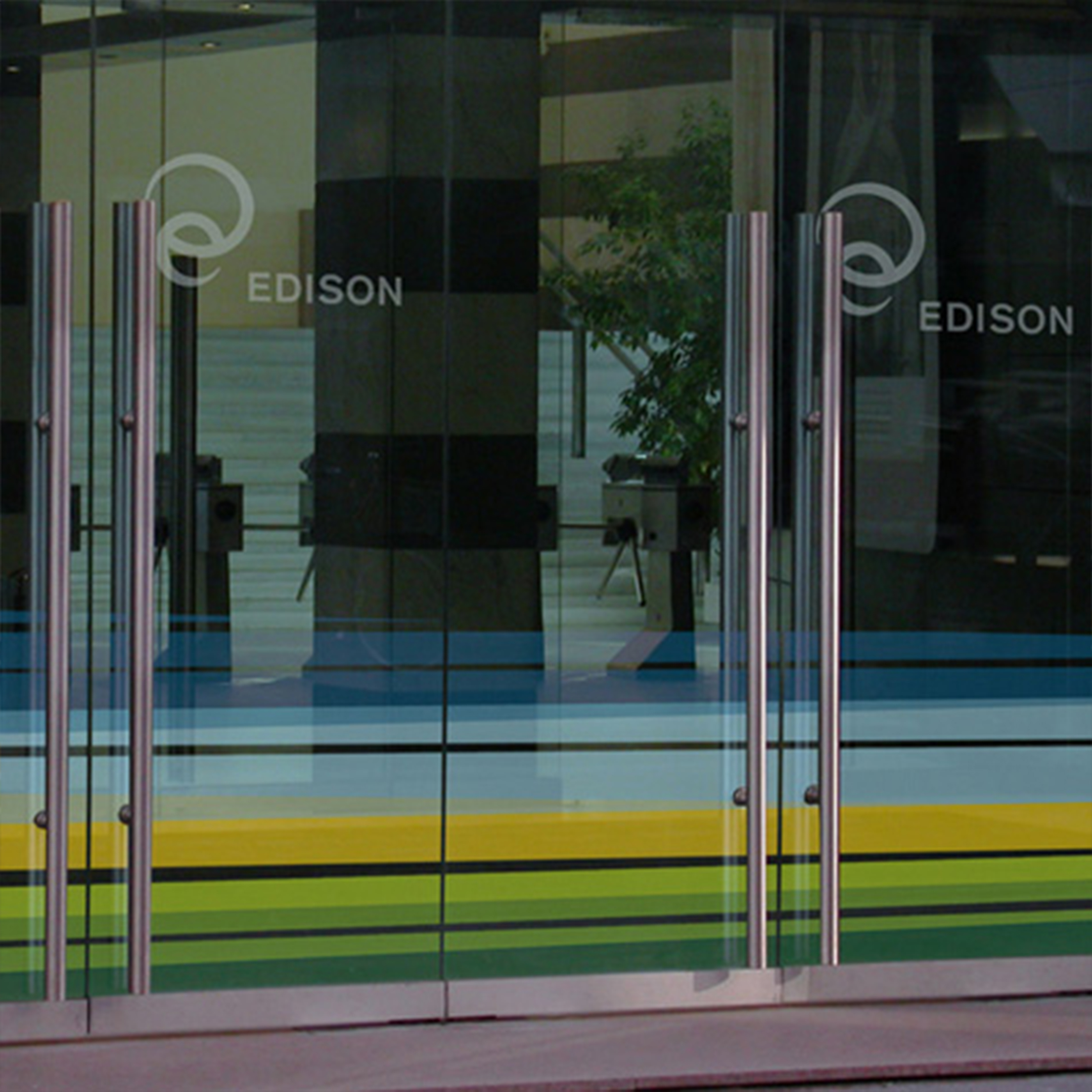
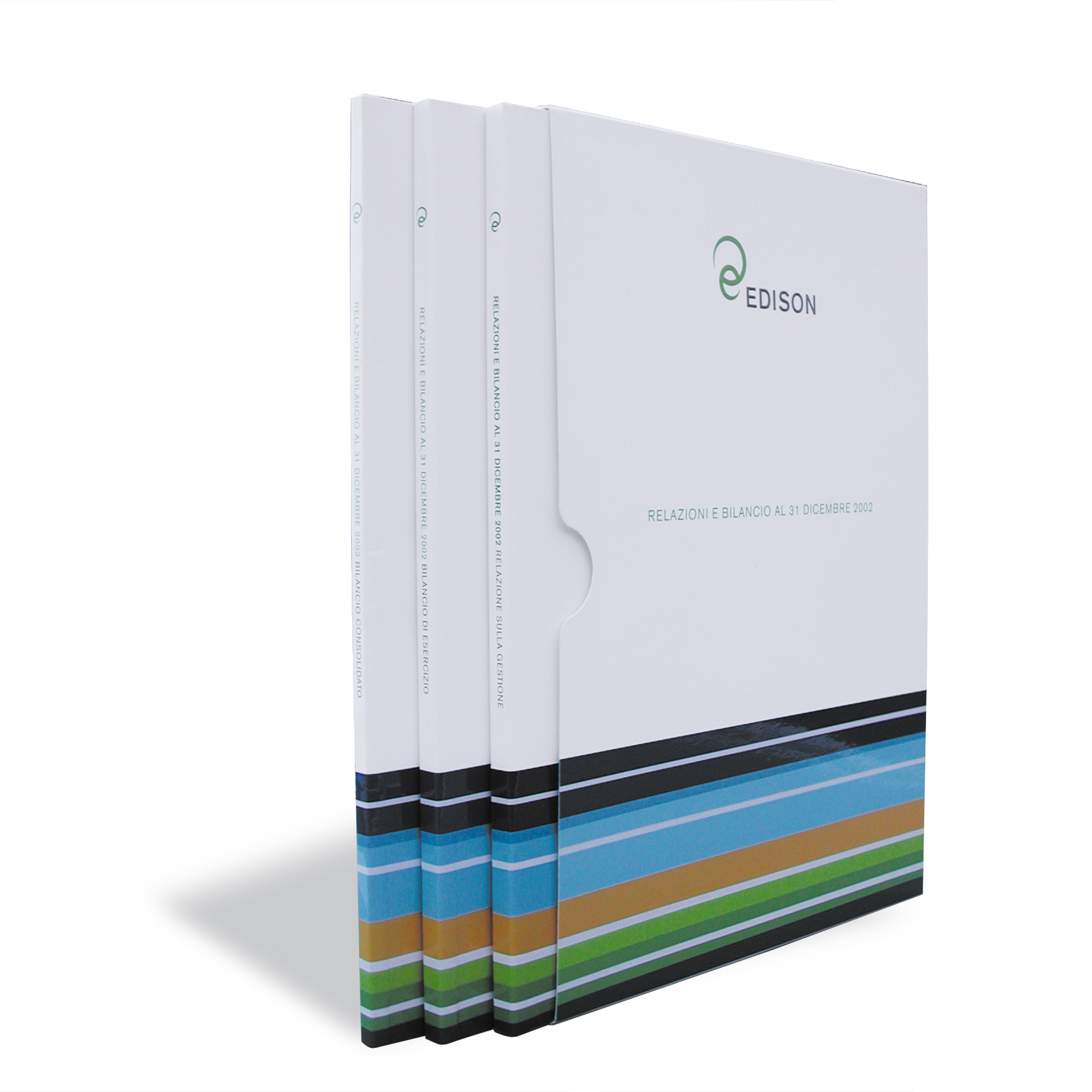
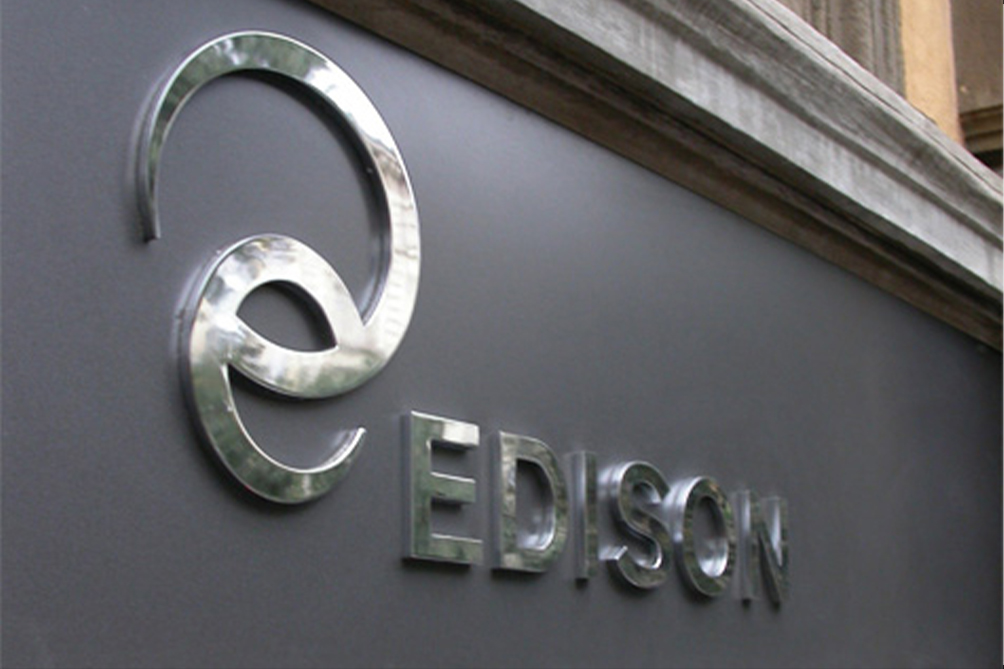
The brand design is built around a logo constructed from circular arcs that evoke the roundness of the earth, the sun, and the sky—understood as the original and renewable sources of energy—conveying a sense of movement and dynamism.
The form of the logo, which opens and wraps around itself, not only recalls the “e” of the name but also symbolically suggests an embrace, expressing protection and closeness to the user while reinforcing a more human and direct relationship with the brand.
Green—resulting from the combination of blue and yellow—helps move beyond the cold, detached perception typically associated with the energy sector, introducing instead a warmer, more welcoming image that feels closer to people.