A2A is an Italian multi-utility company established in 2008 through the merger of AEM Milano and ASM Brescia, with the incorporation of Amsa and the subsequent acquisition of Ecodeco. It operates in the energy, environmental services, and networks sectors, providing innovative and sustainable solutions to households, businesses, and public administrations. With a strong focus on the energy transition and renewable energy sources, A2A is among the leading national operators, delivering essential services with high quality standards and strong attention to local communities.
Naming, Brand Identity e Brand Design. Energy and recognizability
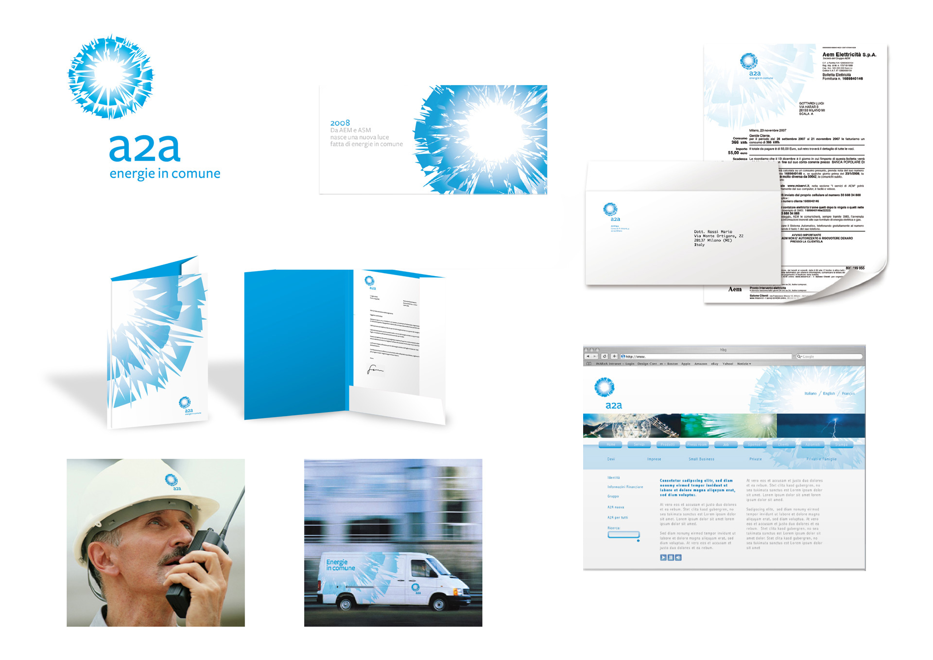
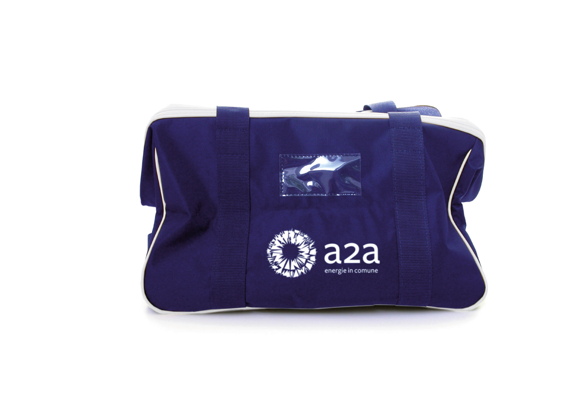
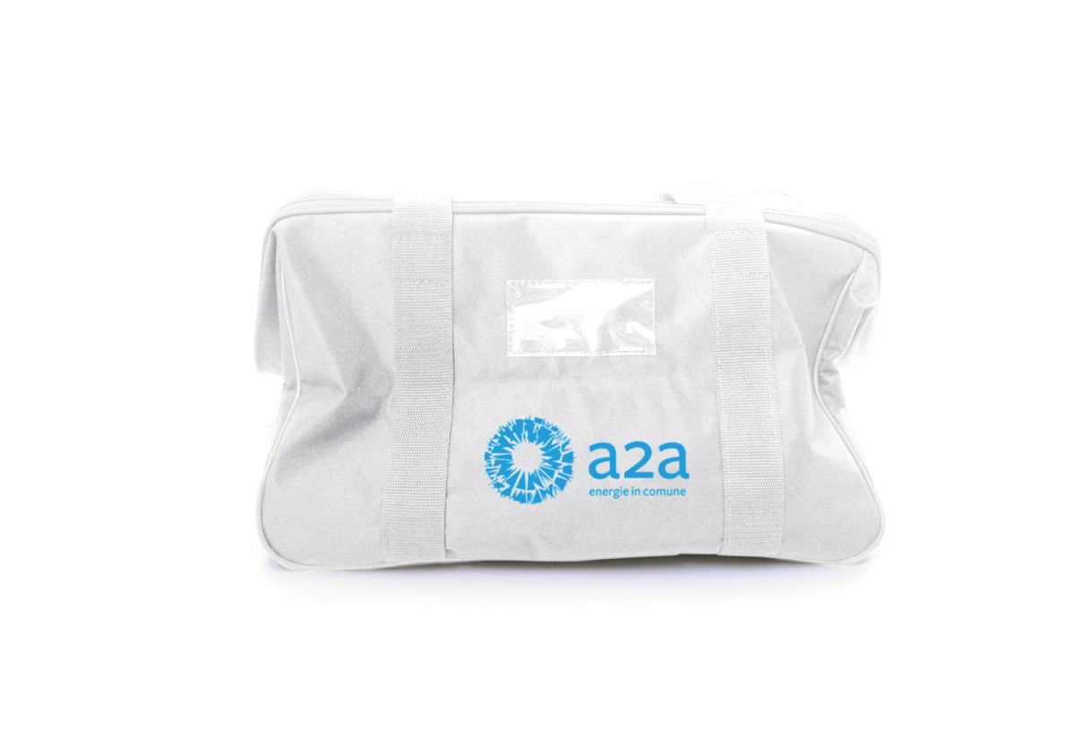
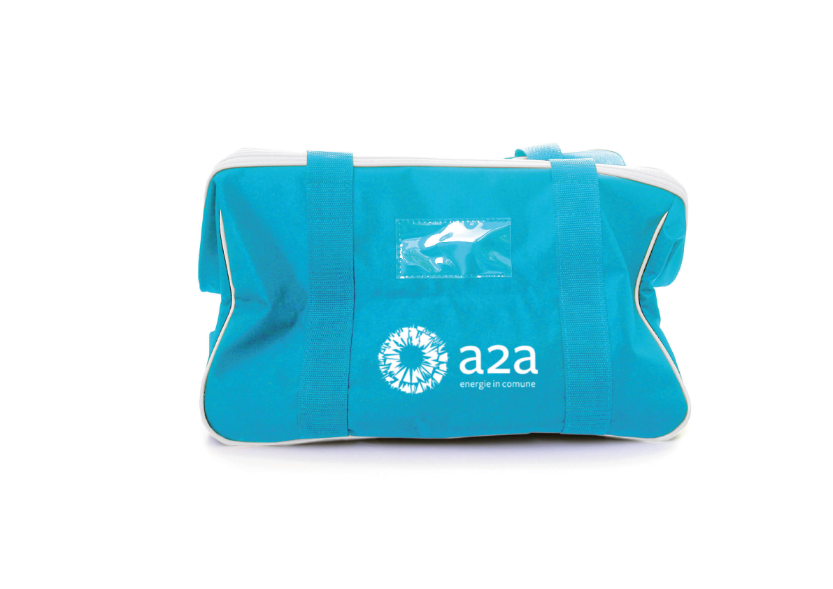
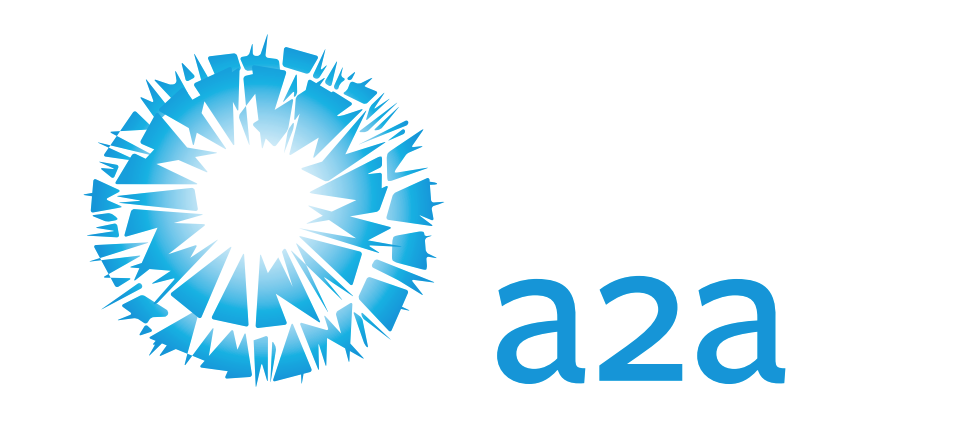
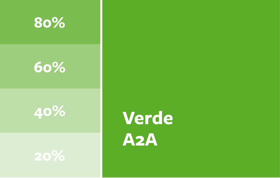
Inarea supported AEM and ASM during the delicate phase preceding the merger, defining the new name which, through the number 2, is intended to emphasize the active presence of the two parent companies within the new entity. From this, the brand design was developed, combining the overlap of two hypothetical suns into a single mark. The reference to the energy of the most important star is evident, and the graphic combination conveys movement and vitality, while the light radiating from the central core emphasizes the company’s power and dynamism. The color choice recalls the historical roots of the two parent companies, while moving away from traditional institutional blues in favor of fresher, more contemporary tones.
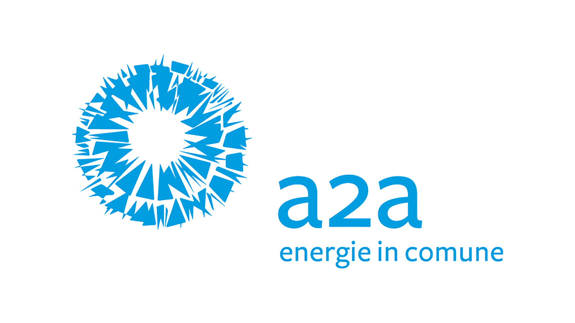
The logotype, designed with the typeface Freight Sans, linear, modern and with soft forms, completes the visual system. The use of lowercase in the name conveys warmth, simplicity and closeness, communicating a direct and friendly tone. The trademark is accompanied by the tagline “energie in comune” [energies in common], highlighting A2A’s role as a unifying presence in the territory, with a plurality of communities, traditions and shared resources.
Communication Design – Designing Communication for the Future
The logotype and the related font constitute the primary element of the visual identity, used across all communication materials, from institutional publications to forms, advertising and digital communication. The medium and bold versions of the typeface ensure consistency and readability.
The project created a visual platform that laid the foundation for the company’s corporate communication, building a system capable of supporting future growth, expansion to new integrations, and rebranding.