Fairy tales, metaphors, and everyday objects

Castello Articolo

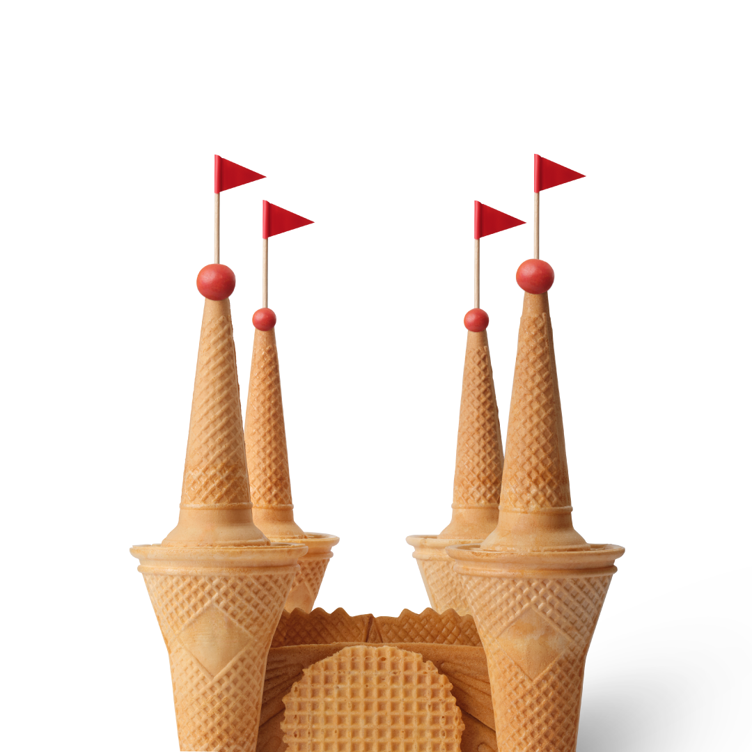
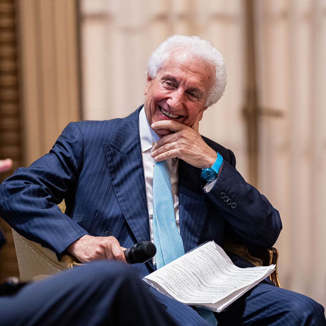
Calendarea is the editorial project through which Inarea has been telling time for thirty-five years using metaphorical images. It is not a simple calendar, but a narrative device: twelve images that distill visions, intuitions, and a design methodology. A serial story that uses photography and composition as a critical language, capable of interpreting the spirit of the time and transforming it into shared imagination (discover the calendars). Why a physical calendar in a dematerialized age? Antonio Romano: It is an analog witness to an increasingly dematerialized world. It is almost an act of resistance! People need to recognize themselves in something: the secret of Calendarea lies in bringing together objects that seem incoherent, which—once recomposed—become familiar. It is a child’s game that also manages to surprise adults. And then, after so many years, it has become something to collect. For many, the calendar is an eagerly awaited story—so much so that I’ve become “the calendar guy”! Why do metaphorical images work? Because they start from what we already know. It’s the same mechanism that makes the narratives of Alessandro Barbero and Aldo Cazzullo so effective: they deal with familiar, recognizable themes, but break them apart and explore them in depth, giving us back the pleasure of understanding. Calendarea’s images work in the same way, with one decisive addition: irony. There is always a playful, almost childlike dimension that invites a game of recognition. Everyday objects, recomposed in unexpected ways, generate surprise and lightness, encouraging openness and a deeper reading. They attract us because they are familiar, make us smile because of how they are constructed, and only then invite a more lateral, slower, more conscious gaze. Without surprise, however, they would be mere descriptions—and they would not engage us. The theme for 2026 is fairy tales: why? We need hope. Just saying the word “fairy tales” makes eyes light up. We are living in dark times, and there seems to be little reason to believe they will improve anytime soon. Fairy tales therefore become a refuge—but also a truth: fairy tales are true, because they speak of the dreams that keep us alive. This is why we turned to Italo Calvino: fairy tales contain deep, universal truths that explore essential themes, revealing fundamental aspects of everyone’s lived experience. They are a form of storytelling, a kind of cinema that brings together different arts and shows reality through fiction. Which subjects do you love most in this calendar? Following every step—from concept to drawing, from mock-up to photography, from post-production to page layout—I can’t really have favorites: in a way, they are all “children”… Over thirty-five years of calendars you’ve created more than 400 images. How do you imagine the future of these images? It’s a question we often ask ourselves: how to make the most of—and renew—such a vast and creative image archive. There always needs to be a connection between the subjects and current events. A few years ago, we experimented with a newsletter that linked a Calendarea image to a news event of the day, and it worked very well (discover Imaginarea Daily). The next step will be to involve the audience more, making the narrative less one-directional. The images are there—we just need to keep them alive. Read also: Monica SolimenoReflections and behind the scenes of the Inarea Calendar

When sport leaves a tangible legacy

Figc Giovanni Valentini Immagine Newsletter Inarea 1

The Milano-Cortina Winter Olympics are already in full swing, and the FIFA World Cup in Canada, Mexico, and the United States is appearing on the horizon. Major events that go beyond sport and media visibility: they transform territories, leave behind permanent infrastructure, generate social value, and inspire new generations. We discuss this with Giovanni Valentini, Chief Revenue & Marketing Officer of the FIGC, to understand what truly remains once the spotlight fades. “What is the main challenge when organizing a major sporting event? Major events truly work only if they leave a lasting mark. Media visibility is fundamental—broadcasting rights are the engine that brings sporting achievements to the world—but on its own, it is not enough. The real game is played on the legacy for the territory: infrastructure and services must be designed from the very beginning with the post-event phase in mind. A venue cannot be built as a ‘cathedral in the desert’; it must be a living, usable space that is sustainable over time. “This is why sustainability is not a trend but an evergreen: it means creating a concrete and lasting benefit for those who inhabit that territory every day. How much does the involvement of local communities matter when planning a major event? It is at the very core. The local area should not just undergo the change, but feel like a part of the project. Collaboration with institutions and citizens is essential, because those works will ultimately belong to them. “And when there is collective endorsement, the project is accepted and truly valued. Milano-Cortina is a case in point: certain infrastructures were shared with the communities from the very beginning, and today they are reaping tangible benefits. What kind of social impact do major events generate? Massive. They draw people to sport, especially the younger generations. The Olympics, for example, shine a spotlight on disciplines that receive little visibility during the rest of the year. A single medal is enough to spark emulation: suddenly, everyone wants to take up fencing, rowing, or skiing. Victories are a powerful engine for participation and positive values. How do you keep public engagement alive beyond major events? “As mentioned, victories are a huge help, but today they are not enough. The average fan’s attention span has shortened; we all have a second screen in hand. This makes it necessary to tell the story of sport differently, blending it with other worlds: music, cinema, or even influencers to reach those who are not ‘pure’ fans. Old and new communication tools: how do they coexist? “The challenge is making them speak to one another. Social media has become the thermometer for communication campaigns, but it doesn’t replace traditional channels. I’m thinking, for instance, of the Football Museum in Coverciano, which remains a physical space for storytelling, memory, and emotion. Today, however, even a museum must be reimagined for the modern age: it’s not just a place to visit, but to live and share. People want an experience; they want to take a photo and tell their story. Iconic spaces, installations, and visual content thus become a bridge between the physical and digital worlds, making people feel part of a wider community. And what about new technologies like AI? Artificial Intelligence is an incredibly powerful tool for content, with an impressive quality of imagery. We recently used it to create a greeting video for our fans that played on a key concept: technology can create almost anything, but it cannot invent fan passion. Without the presence of people—in the stands, in front of the screen, within the communities—sport loses its most authentic meaning.

Canova. From founder to community

Canoviano D'Onore 2023 173

Stefano Balsamo, chairman Italy of JP Morgan for 56 years, founded the Canova Club in Rome in 1978—at first, simply as a workable way for banking professionals to find each other. What started as an informal arrangement has, over time, grown into a community of several hundred members in Rome and Milan, alongside the international Diplomatia network.Balsamo refers to himself as an “aggregator of people”, a definition that reflects a natural inclination toward leadership and a practiced ability to build relationships based on friendship, culture and a concrete sense of solidarity—values that have gradually, and quite deliberately, shaped the identity of the Canova Club. When and how was the Canova Club founded, and what is its vision for the future? It began in Rome, at Bar Canova in Piazza del Popolo, out of a straightforward professional necessity linked to my work: understanding what Italians employed by foreign banks were actually doing. There was nothing conceptual about it—just a pragmatic, distinctly “American” approach, focused on concrete outcomes rather than abstract discussions.The real turning point came when we started inviting external experts to share their knowledge—such as the then largely unknown Giulio Tremonti in 1978, followed later by Mario Draghi, Piero Angela, and several other figures who would only become famous much later. That shift—from narrowly technical meetings to more open conversations—quietly transformed the group into a place of friendship and culture, where culture meant building relationships beyond affiliations in order to enable the exchange of ideas.As things evolved, it became necessary to give some structure to what had originally been informal gatherings, resulting in around thirty services built on our core values: Friendship, intended as a spontaneous gift; Culture, as a serious commitment to sharing knowledge; and Solidarity, directed toward supporting “those without provision”. What began as a vertical exercise focused on finance has since become a horizontal community, bringing together people from different backgrounds around cultural initiatives and social support. The model remains intentionally simple: members and stakeholders come together not to attend, but to contribute—personally and directly. We will also be opening a Canova Club in Naples shortly, following the same spirit of friendship and simplicity that proved workable in Milan after Rome.Over the past three years, I have focused on ensuring that the Club is able to continue without me. This process led to the creation of the Foundation and to a governance structure with presidents and general directors, including Chiara Di Ciro, general director of the Canova Club Milan Foundation; Federico Ghizzoni, president of Canova Club Milan; Francesco Farinelli, general director of Canova Club Rome; and Giancarlo Abete, president of Canova Club Rome. What are the initiatives of Canovalandia, the Third Sector organization? We operate under the motto “Providing for those without provision.” In concrete terms, this means working alongside the very last of the last—contexts where good intentions are not enough and where structures simply lack the entrepreneurial or managerial tools to sustain themselves. My role is to raise funds from members and—now that any banking-related conflicts of interest are firmly behind me—to organize initiatives in a more orderly way, while deliberately keeping the entire operation voluntary.A defining trait of the organization is a certain rigor in making sure that funds actually go where they are meant to go. Documentation is always requested; trust is important, but verification is non-negotiable. In Rome, we support initiatives such as Docce al Colle Oppio for people experiencing homelessness and Casa di Lorenzo, which welcomes young people with Down syndrome. In Milan, we collaborate with Ronda della Carità e della Solidarietà ODV, assisting people without shelter, and with Asilo Mariuccia, which provides physical and psychological support to mothers and children in difficult circumstances. Could you tell us about the rebranding, carried out in collaboration with Inarea? The rebranding was the final step in stepping out from the founder’s “shadow cone” and releasing the Club from an image that had become, admittedly, a little too centered on me. It was meant to signal a clear change of phase, summed up—without excessive reverence—in the deliberately self-ironic slogan: “Balsamo asks Stefano to leave the command post.” I agreed to the change of logo not out of nostalgia, but out of responsibility toward the Club and its future. I was struck by Inarea’s generosity and level of commitment, particularly by their ability to listen rather than impose. In the new visual identity, the double “C” remains as a sign of contact and friendship, but its meaning has been recalibrated. What once alluded to the coin, a nod to the Club’s financial origins, now refers to the person—expanding the notion of community and relationship that today, quite clearly, defines the essence of Canova.

Inarea: a design crafted over 45 years

Logo 45 Anni

Inarea’s 45 years offer a precious opportunity to reflect on the past while imagining the future. Although it is usually the ‘round-number birthdays’ that inspire the deepest reflections, this milestone nonetheless invites us to take stock of brand-identity design in an era in which both design and communication have been transformed—technically and in content—more than ever before. Many of the rules and tools of 45 years ago no longer exist, yet the fundamental principles—those ‘as old as the world itself’—remain steadfast. Antonio Romano, what inspiration guided the very beginning of this journey? At the beginning, we were driven by the dream of total design: the idea of designing ‘from the spoon to the city,’ where graphic design became a bridge between disciplines— a universal language for every form of expression. This ideal has deep, age-old roots: we can think back to the era of the Herald, who designed the prince’s coat of arms and applied it to everything—architecture, uniforms, and textiles—creating a symbolic system of belonging in times of widespread illiteracy. In the end, the underlying logic of branding has not changed all that much. Even today, despite an extraordinary technical and technological transformation, the principles remain the same. In recent decades, communication has undergone an astonishing acceleration. With the advent of digital, what aspects of branding have changed the most? The 1980s were the era of visual exaltation. Then came the 1990s, with mobile phones and the Internet—a convergence that would change the course of human history. Attention shifted from the heraldry of the product to that of the corporate realm, but the next step was the relationship itself: products and services became experiences, and the individual moved to the center of everything. We live and work within a digital dimension—an immaterial space in which we spend much of our active time. The physical touchpoints of the past have been integrated—and often replaced—by countless online interactions. “The real challenge today is to build coherence—in words, in images, and in the brand’s digital gestures—because the user’s judgment is formed in an instant, and is often swift and unforgiving. In such a complex and fragmented world, what core principle is essential for creating a successful identity? The principle we uphold is authenticity—the foundation that makes a brand’s statements about itself credible and verifiable. Without authenticity, the audience turns away. This stems from the convergence of a trilogy: Purpose (why you do what you do), Process (how you do it), and People (those who make it possible, both inside and outside the organization). Is brand identity today becoming increasingly multidimensional and multisensory? And is Inarea also moving in that direction? Certainly. For us, the concept of Brand Sense has become almost an obsession. But in truth, it is anything but new. The Church, for example, is a master of branding: the scent of incense, the verticality of the bell tower dominating the view and carrying the sound of its bells, the atmosphere that weaves together sight, smell, and hearing into a single experience— not to mention Communion, the sublime moment of the celebration, where even taste is engaged. Even Romanesque architecture emerged in response to the need for better sound propagation following the introduction of Gregorian chant. All of this teaches us that the more a brand succeeds in engaging multiple senses and generating synesthetic coherence, the stronger and more memorable its impact will be. How are you at Inarea preparing for your “golden anniversary”? We are integrating skills that we once entrusted to external partners—especially in the digital realm—and we are embracing Artificial Intelligence as a tool to amplify both the speed and the depth of our content. Our craft requires us to look through the eyes of those who observe us—our stakeholders—yet the essence of identity value does not change: we aim to continue creating, through design, an implicit and immediate form of communication, capable of generating impact without the need for explanation. As Oscar Wilde said, “beauty has the advantage over genius in that it needs no explanation.” We will therefore continue to give shape to a promise of the future, remaining an enterprise inspired by the Renaissance workshop, yet equipped with a ‘brand corridor’ capable of orchestrating and seamlessly coordinating the many facets of communication.

Healthcare and Identity

Salute Lazio 2

From hospitals to foundations, from pharmaceutical companies to regional health systems, Inarea has told the story of healthcare through brand identity.Each project is a way to make “care” visible — in symbols, in names, in spaces.And above all, in relationships. Public Healthcare: standardizing to humanize The identity projects for the Emilia-Romagna and Lazio Regions introduced an “umbrella brand” approach capable of bringing coherence to a complex, often heterogeneous, and layered system. Salute Lazio is an example of rationalization that goes beyond aesthetics: it makes services, hospitals, and communications immediately recognizable, fostering a unified language between institutions and citizens. The goal is to create a healthcare system that is more accessible and easy to understand, where the graphic symbol becomes an implicit mark of recognition — and therefore, a guarantee for citizens.The rebranding of Salute Lazio took shape through a strategic intervention that simplified and unified the identity of the regional healthcare system. The new name, “Salute Lazio,” is accompanied by the descriptor “Regional Healthcare System,” while the logo was designed to visually evoke the red cross, the universal symbol of healthcare. The graphic symbol, derived from the letter “L” in Lazio, ideally reconfigures a red and blue cross and has been used as a distinctive element throughout all communications, creating a coherent and easily recognizable system. This approach made it possible to integrate the various regional healthcare structures under a single identity, streamlining and rationalizing the overall service offering while enhancing the effectiveness of institutional communication. Hospitals and Foundations: welcoming spaces From the Gemelli University Hospital to the Bambino Gesù Children’s Hospital and the Santa Lucia Foundation, Inarea has supported these prestigious institutions in building a visual identity capable of making hospital environments more contemporary and empathetic. The wayfinding system at Gemelli, inspired by major airport hubs, was designed to facilitate patient movement, restoring a sense of autonomy and confidence. Its brand identity, developed to mark the hospital’s fiftieth anniversary, translates the institute’s founding values into a visual language: Catholic roots, care for the individual, and a vision of healing as a vital act. The Gemelli blue and the “G” that unfolds into a cross, leaves, and a human figure together tell the story of a form of medicine that unites faith, science, and humanity. In the case of Santa Lucia, the Tree of Life symbol evokes a sense of rebirth, while at the same time recalling the two hemispheres of the human brain — roots and thought, matter and mind. Industry and research: when the brand unifies Private healthcare and the pharmaceutical sector represent the other half of the story. Inarea developed the visual identity for GVM (Gruppo Villa Maria), simplifying its name and strengthening its positioning as a network of excellence in care and research. The Angelini Industries project, on the other hand, brought together a wide range of diverse activities, placing purpose and direction before traditional, product-based distinctions. The pharmaceutical field, in fact, represents just over half of the entire system.The Aventis Pharma case, from the early 2000s, stands as a paradigmatic example in the history of pharmaceutical branding. It created a unified packaging system for ethical products within a multinational company born from the merger of six different brands, giving a single voice to medicines distributed worldwide while maintaining full compliance with local regulations. It was, in effect, defined as a universal visual code — a language of symbols, colors, and informational hierarchies capable of making each medicine instantly readable, regardless of the target market. Over time, the project remains an important example of how branding can serve not only as an expression of identity, but also as an organizational lever, capable of restoring order and clarity. Foundations of the common good From Smile House, which treats craniofacial malformations, to the Veronesi Foundation and the Piedmont Foundation for Cancer Research, design becomes an ethical language. Each brand is an act of giving back — a way to give form to solidarity, to research, and to hope. For example, the rebranding of the Veronesi Foundation — an institution that supports excellence in scientific research and promotes a culture of prevention — enhances the legacy of its founder and, through the “V” in the logo, becomes a human and dynamic symbol, capable of adapting to the various fields of research represented by the ribbon, the universal symbol of struggle and hope. Even in healthcare, branding is an infrastructure of meaning — a tool for making care more human, and therefore, more effective.

Relationship as care

Copertina Healthcare

At a time when everything revolves around personal experience and identity, medicine too must find ways to keep up with the times. Healthcare cannot simply be a system that provides treatment; it must become an ecosystem that truly cares — for the person, for their ways of expression and the stories they tell, for their spaces. And, as in branding, relationships become the heart of trust. We discuss this with Antonio Romano. Where does the modern concept of healthcare come from? Its roots lie in ancient medicine. From Hippocrates to the Salernitan School, health was seen as a balance among elements — air, water, earth, and fire — and bodily humors. Over time, medicine shifted from a “geocentric” view to a “morbocentric” one, focusing more on disease than on the person. Today, we are witnessing a new transition: from curing illness to embracing relationships as a form of care. What does it mean to bring this transformation into branding? It means viewing “care” not as a technical act, but as a narrative value. Brands, much like doctors, no longer offer only products or services — they offer experiences of trust. Healthcare thus becomes a field of communication that places the person, their emotions, and their need for understanding at the center. “Care” is expressed through language tailored to the patient, through a corresponding tone of voice, and through spaces designed to welcome and comfort. How should healthcare facilities adapt to this new perspective? It is necessary to move beyond the rigid and often impersonal organization of hospitals. The digital experience has accustomed citizens to direct, fluid, and disintermediated relationships in which each individual is always at the center. Healthcare must also embrace this logic, with more intuitive navigation systems, clearer pathways, and open dialogue. The wayfinding system at Policlinico Gemelli, inspired by airport signage, is an example of this approach — designed for those who need to find their destination, not for those who already know the space. The role of design and visual identity in this context? Fundamental. Branding is the grammar that coordinates the countless stories that make up the world of health. It is not just about a logo or color, but about coherence between behavior, language, and mission. When the Lazio Region adopted a unified identity as Salute Lazio, it was not merely a graphic choice but a way to make the system more recognizable, accessible, and human. Which example among Inarea’s case studies best expresses the concept of “care”? The rebranding of Assogenerici as Egualia is emblematic. From an association once perceived merely as a producer of generic drugs, the narrative has evolved toward a message rooted in Article 3 of the Italian Constitution: equality as a principle of equity in healthcare. No longer “producers of copies,” but advocates for the right to healthcare for all. What is the cultural challenge of the future? Putting the person back at the center. The digital age has taught us that everything starts from the “self,” but in healthcare this “self” must move beyond the traditional subordination of the citizen — made an even weaker participant by becoming a “patient.” They must feel welcomed, not isolated. Relational medicine is the true frontier of contemporary healthcare: a form of medicine that listens, supports, and above all, communicates.

Telling the story of a university: coherence and identity in a connected world

Immagine evidenza Articolo Luglio

A university is not just an institution that teaches. It’s a world that tells its own story, that engages those who choose it, and that projects the future it promises. And in an increasingly connected, emotional, and competitive world, it’s the story that truly makes the difference. Today, a university communicates across many channels, which makes consistency — both online and offline — essential. Websites, social media, physical spaces, events, and materials all need to speak the same language. The digital experience, in particular, must be clear and accessible: it’s often the first real point of contact with the university and can strongly influence how its identity and credibility are perceived. A university’s brand identity is what makes it instantly recognizable — but also what speaks through the messages it conveys. It’s not just a logo, and even less a crest: it’s a mix. From the name to the colors, from the website to open days, every detail — signs, tone, style — tells the story of who you are and why someone should choose you. Case Studies Conservatorio di Milano A dynamic logotype combines different typefaces to represent musical plurality. The graphic movement creates a visual mark in constant transformation, while the spatial reference remains stable, grounding history and identity. Sapienza A brand identity and brand architecture project that streamlined the complexity of a large university by simplifying its naming, redesigning historical symbols, and introducing a custom typeface. Opit A project that communicates innovation, flexibility, and social impact in the field of digital education. A visual identity built on binary symbols, modern typography, and a dynamic color palette to stand out in the online education landscape. Case Studies A brand identity that brings together academic culture and the business world, using a clear and straightforward language. The constellation symbol evokes the idea of the future, while the blue color conveys stability and reliability. LUISS A project that conveys an idea of education as continuous growth, symbolized by a column transforming into a capital. A consistent visual and typographic language reinforces a sense of belonging and openness to knowledge. Intercultura The brand design reinforces autonomy by emphasizing the name as the central element of the logo. The reference to AFS remains in the background, acknowledging the origins while highlighting a more evolved and independent vision.

Pubblicato da Inarea Identity Design | Privacy Policy
Ultimo aggiornamento: 2026-01-21